Digital Tarot/Oracle Card Deck Publishing Apps Leap Ahead with Deckible 1.0.8

New release includes: Onboarding Wizards, Updated Timeline /Home Page, Tarot Focus, Try Pre-Signup, In-App Signup, Usage Metrics & More
This is a major release with a bumper list of features and updates.
With our new team and resources, 1.08 sets a cadence for future releases.
First grab a coffee and ponder on this post. Lots to digest. Then dive in and draw some cards and test out the new spreads and the onboarding.
Speak up if you are not finding things to match your expectations. I urge you to be vocal: feedback@deckible.com
Vision Recap Deckible
It's worth a quick recap of our vision, so you know where we are heading and why.
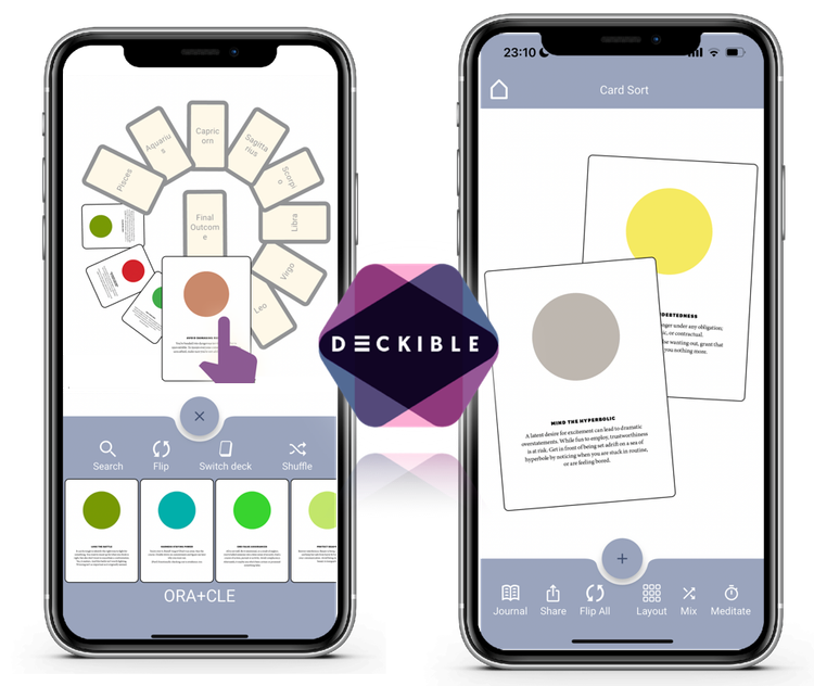
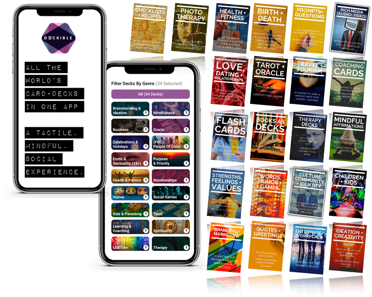
Our vision is unify Tarot Decks, Mindfulness Decks and Coaching Decks (aka Card-Sorting) into an engaging tactile experience for phone/tablet and desktop.
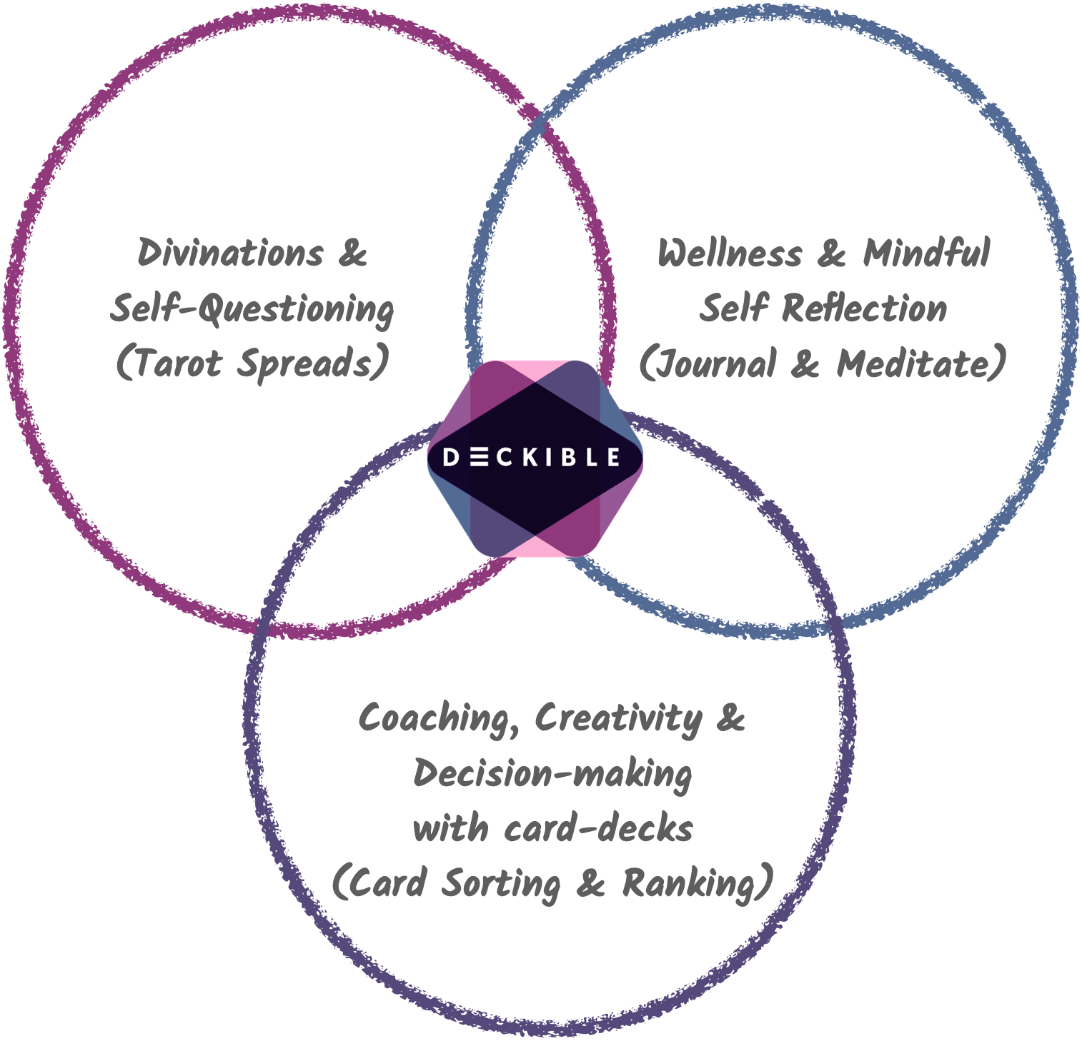
Deckible's app manages all your card decks to offer a modern experience that is both unique and valuable.
- Spare moments: We help you make the most of our spare moments, when we have our phone in our pocket.
- Rituals: We help you create your daily rituals around journaling, meditating & sharing.
- Never left at home: We make it possible to use the card decks you love on the go. Never leave them at home again.
Cards have such a useful form factor for browsing, learning and organizing/decision making. This is why so much of the internet is designed around a "Card" metaphor.
Hence, our focus on unifying the digital Card Decks app/experience.
Release 1.0.8
This release focuses on onboarding new users (teaching people how to Deckible) and filling gaps in the tarot spread features.
Deckible is simple and powerful, but it is different. A little bit of guidance will drive more people to their first "WOW" moment in Deckible.
1. Onboarding Wizards
Each screen in Deckible can have an onboarding wizard. This is the opening screen.
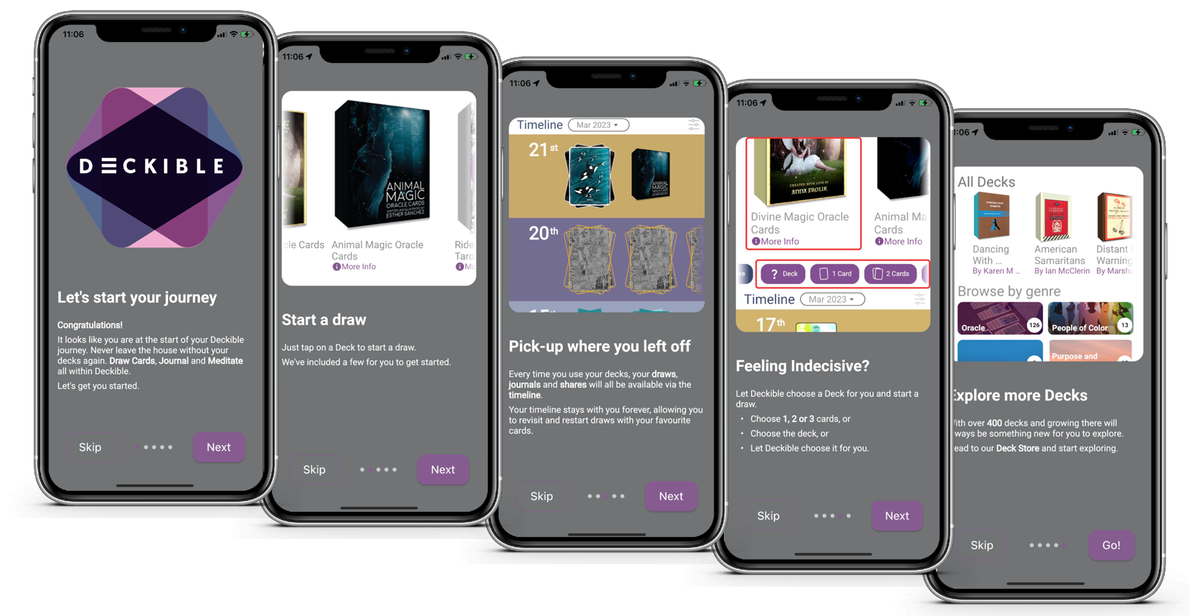
"Onboarding" pops up before you reach key screens, for the first time. Each slider has:
- an image/visual
- a title
- a description
The wizards teach what to expect/try.
For example, we often hear people don't expect to touch, move, size and rotate the cards.
People love it when they realize they can do this, but prior apps have been rigid, so many have no expectation that this was possible.
Also to combine cards from multiple decks. Neither feature is obvious in a new category of digital deck apps.
There's an option in settings to "reset" the onboarding wizards. You see each wizard once only, unless you reset. To demo onboarding, go to settings and click "reset", then close and re-load the app. You will then be re-prompted to see each wizard afresh.
There's an onboarding screen for:
- Starting the app
- Choosing a Layout
- Creating a Card Sort
- Choosing your spread cards
- Exploring your reading
- Exploring an individual card
We think it's a great start. We will iterate on this content & the interactions in future releases.
Let us know what you think.
2. Shuffling the Active Face
You can flip all the cards in card-sorts or spreads. This flips the active face. Previously we shuffled the first face, and for many decks this was the shared back.
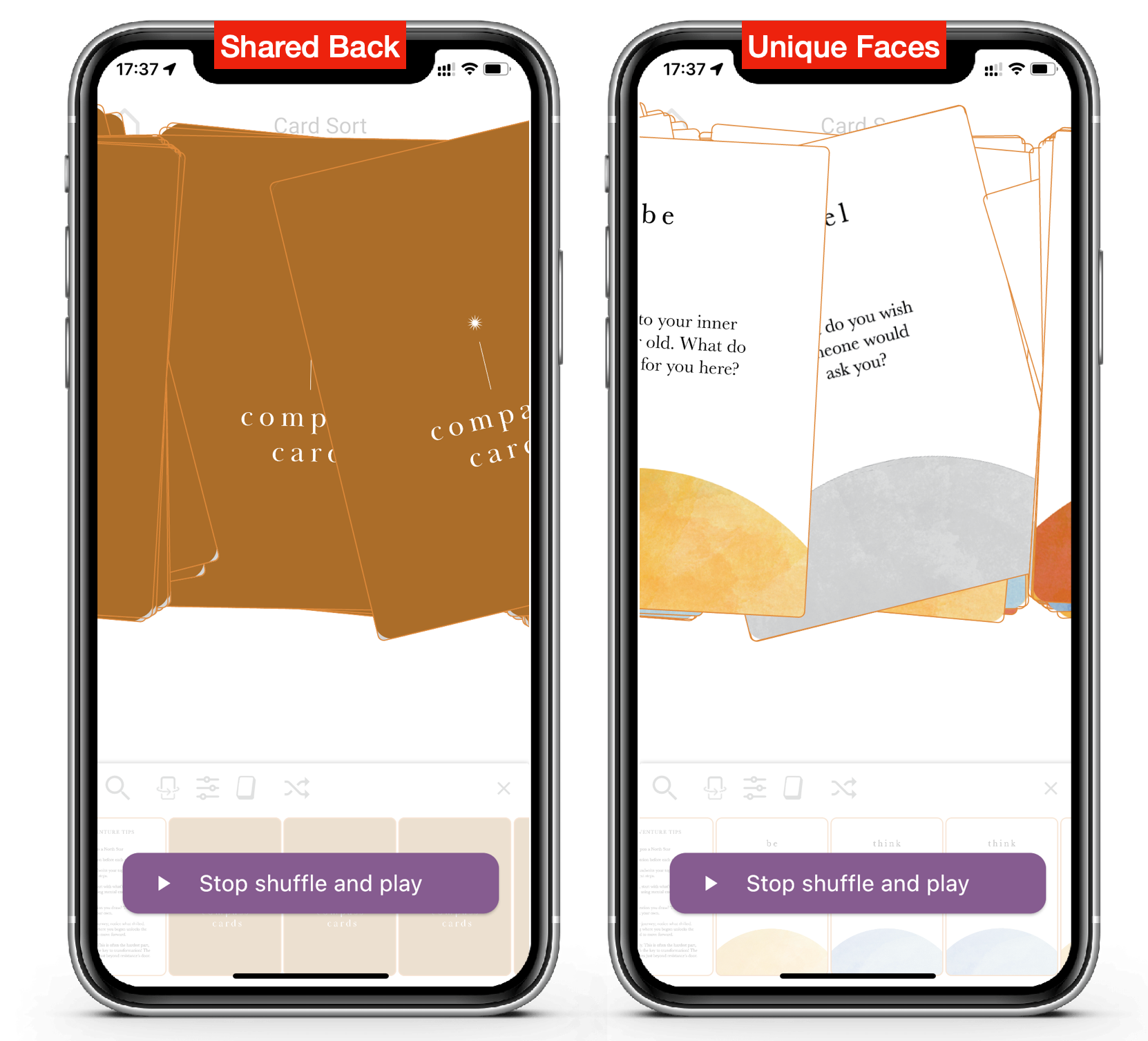
You can shuffle and flip your deck at any point. Now when it shuffles, it shuffles the active face. Powerful and more fun.
Easy to record videos of your artwork while shuffling on phone/tablet.
You can click "stop" at any point, so you control randomness in Deckible. It stops after a few seconds if you don't interact.
Try shuffle for yourself for the full experience.
Deckible decks can have more than 2 faces, so you can shuffle with any face.
3. Mix, Grid and Stop
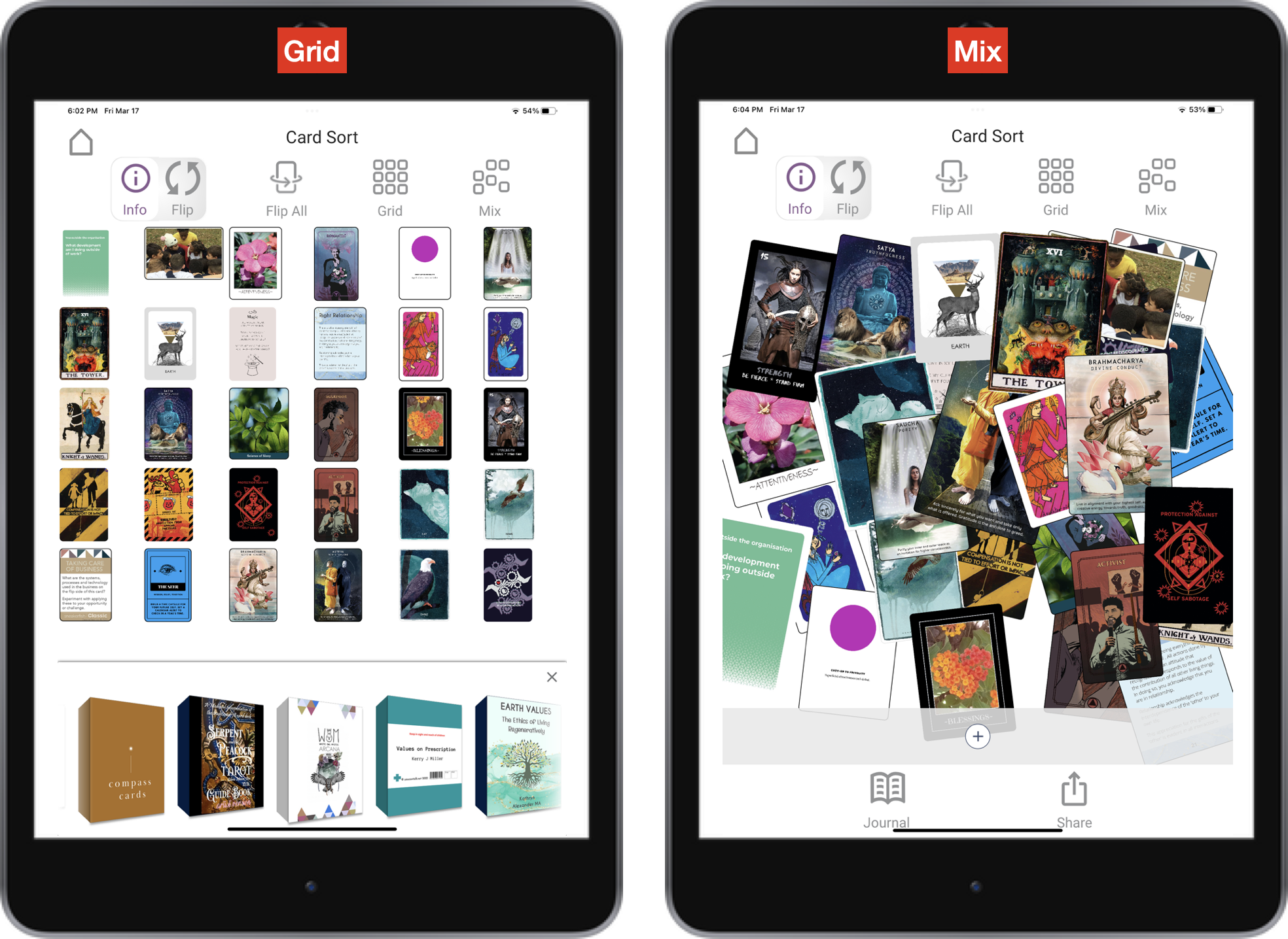
Mix and grid work well together to animate and organize readings. When you click "Mix" the label changes to "Stop" - this is how you pause the mixing cards. It's akin to shuffling the cards you have chosen. It animates cards, shrinks and grows them and changes their rotation and stacking sequence.
An effective way to record videos for sharing on social. It's especially fun when you combine cards from different decks.
4. Multi / Mixed Deck Readings
There's lots of Tarot / Card Deck apps, but none offer a truly tactile experience. Few let you have more than one deck, those that have multiple decs only let you touch with one deck at a time. No fun!
The Alleyman’s Tarot is the top selling Tarot / Oracle decks on Kickstarter. It sold of 20k units pre-launch. The decks is a mixed deck, with cards from 100+ decks. This facebook group has 3.9k members who could not wait for decks to arrive, so they began swapping cards in the mail to make their own mixed decks.
With Deckible, "multi deck" means you can create mixed spreads and as you can see from Alleyman, it meets a human need to customize and individualize experiences.
Deckible makes that process a lot of fun, no need to wait and no postage! I think you will see more features around this topic in the future.
We know card deck owners have many decks and that they love to do mixed deck readings. So now it's super simple. You don't have separate the cards like with a physical deck. The joy of digital!
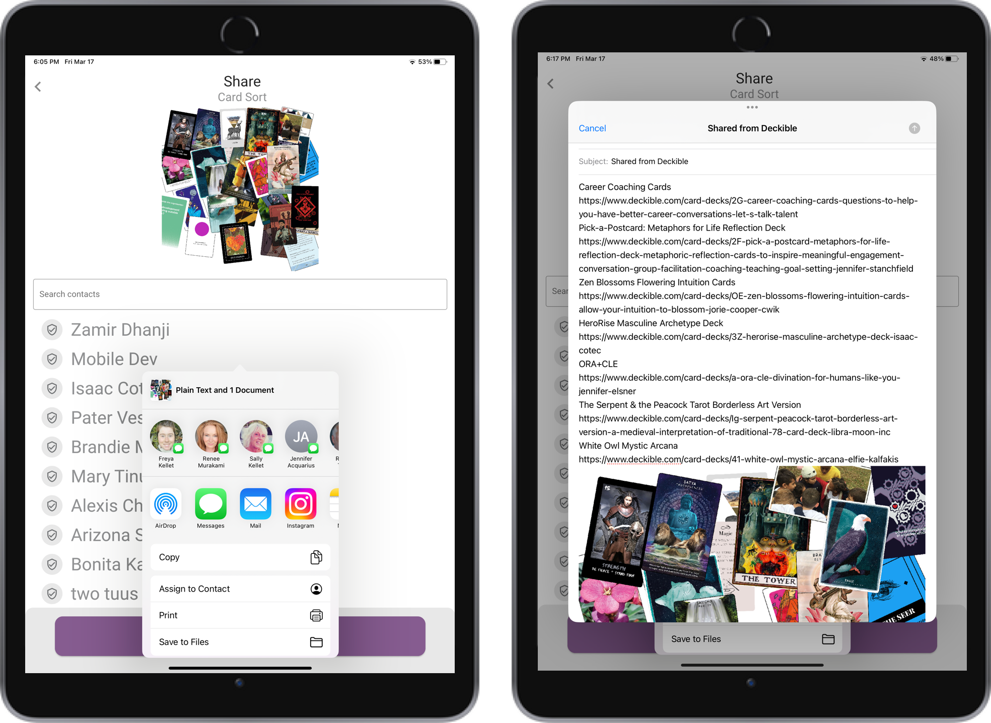
Mixed deck readings now lists the urls and deck names for each deck, when shared.
5. Tarot Focus / Tarot Love
Deckible unites all your decks in one app. We do this to meet the expectations of two groups:
- Coaches who use "Card Sort" type features to use card decks for decision making, collaboration and ideation.
- Tarot spreads are used in the divination community to ask questions and probe into self reflection.
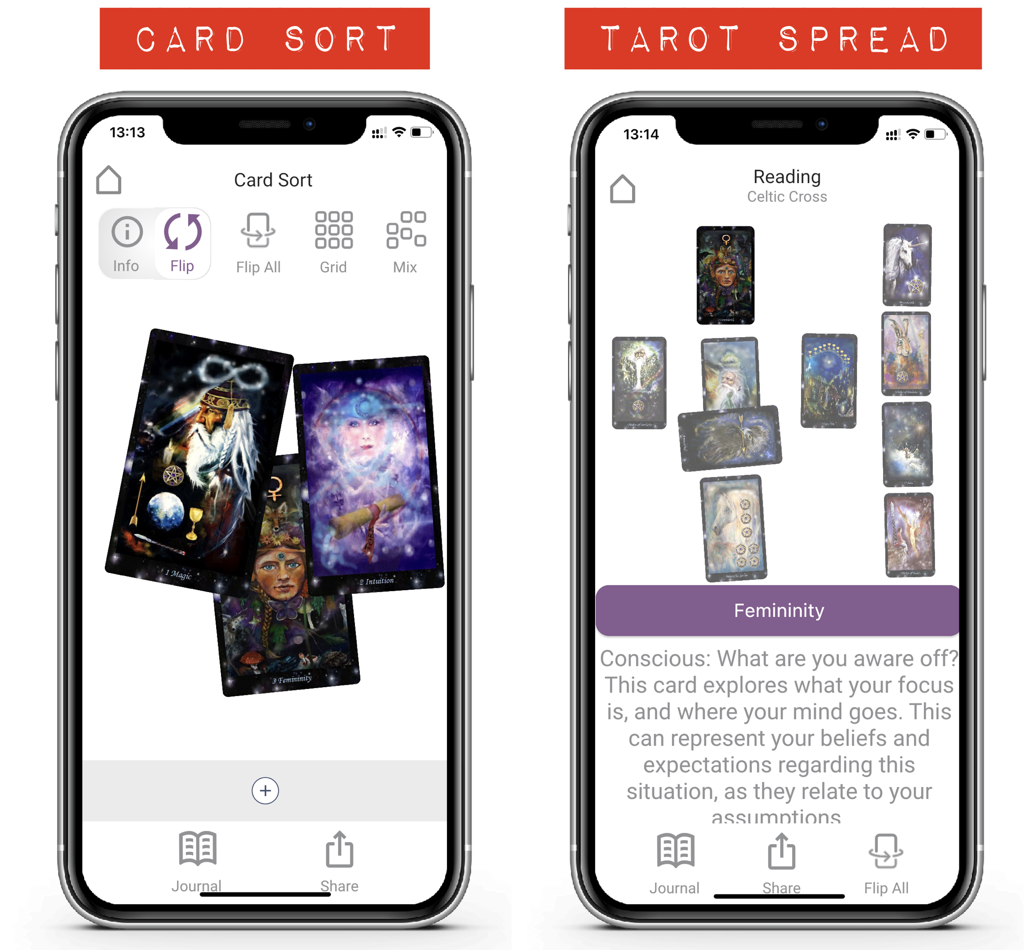
These are two very different experiences. We have learned from each community.
- We know coaches see the value of spreads.
- We know people want to add cards and combine cards from different decks in their readings (ie card-sorts)
- We know people use both approaches in their work and lives.
- We know these two communities have helped us build a better product.
Existing Tarot apps feel dated and rigid. They are certainly not modern of tactile. Their ability to have a meaningful journaling and timeline experiences is negligible.
Broadly speaking coaching card-deck apps are rigid and feel flat and soulless.
We know it's valuable to have both approaches available in one app.
That said we had some gaps that are now fixed in this release. We've updated the Tarot Spread experience:
- Full text: full descriptions are shown for the spread and the cards in a reading. No more clipped descriptions.
- Reduced opacity: None-selected cards were made highly opaque, to give focus to the selected card, but the selected card's name is displayed as a button, so it's not critical to see which card is in "focus". Clicking on the name takes you to the card info for this card. So we reduced opacity, so you can enjoy the fuller visual impact of your spread. That makes for a better sharing experience.
- Fewer icons & click to focus/ click to flip: We removed the flip / info button. Touch any card to put it into "focus". Once in focus, touch it again to flip. "Flip all" moved to the footer menu bar. As a result, more screen room is available for the spread. So the experience is improved.
- Fix to strange characters: For technical reasons, there are many ways to type in apostrophes, quotes etc. Not all of these were being rendering correctly in the app. This was most noticeable on Tarot readings with so much text. We've updated many of these to be correctly rendered. Let us know if you see other things that need to be fixed, and we can add them into a future release.
- Quick Draw on Spreads: Let deckible randomly choose your cards for your spread. Fun, visual and animated. Of course you can still drag chosen cards into your spread. You choose. Choice matters as much as randomness.
Creators can create custom spreads for each deck. Choose which of the standard spreads and custom spreads are available for use with your deck.
Here is the interface to define spreads on Deckible.com.
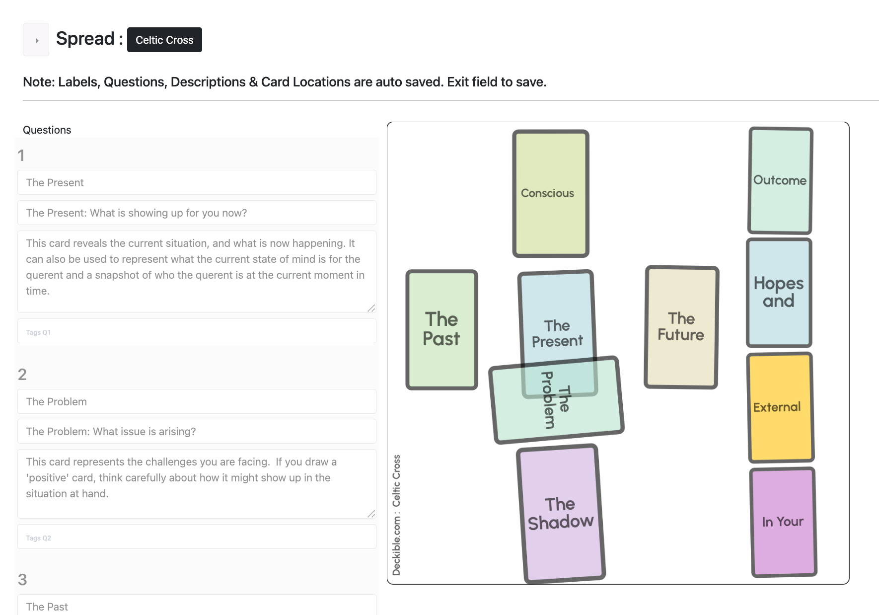
You can have as many cards are you want, you can scale, rotate and arrange the cards as you wish. The interface to create spreads is visual and simple, but you do need to put in effort to complete the following for each card in your spread:
- labels
- questions
- descriptions
This is how this spread is rendered in the app.
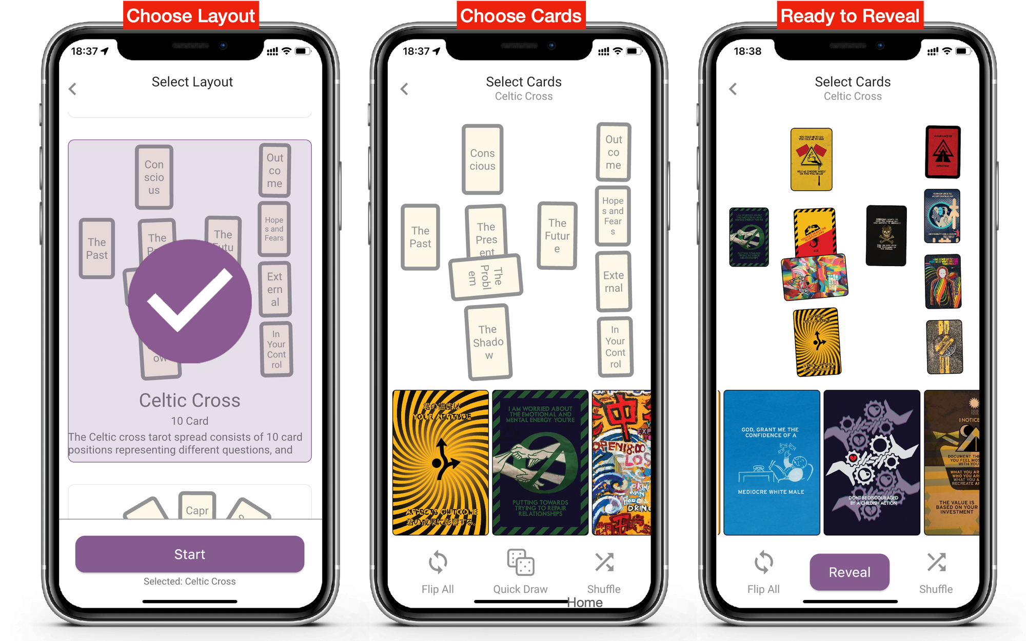
Nothing is quite so flexible or powerful as Deckible.
6. Future Features
In an upcoming release, we will add support for the following:
- Unlock option: to let you turn a tarot spread into a card sort, so then you can move and size the cards as you wish and add cards to your spread. Many people have asked for this. People often add cards to a reading. This offers the best of both worlds .
- Rotate/Navigate through the cards in sequence: you have to click on each card in turn to focus on that card. We will offer a quick way to swipe from card to card.
- Linear reading option: We offer an interactive view of the spread / reading right now. We intend to offer a linear version, so you can see the card by card, along with the text connected to each card linearly. This makes sharing easier and its easier to just read all the text. We will keep the existing experience as this is the best form/function for a phone.
Have you got thoughts on what you'd like to see in a future release? Are there decks you'd like to see on Deckible. Let us know.
7. Updated Tarot Deck:
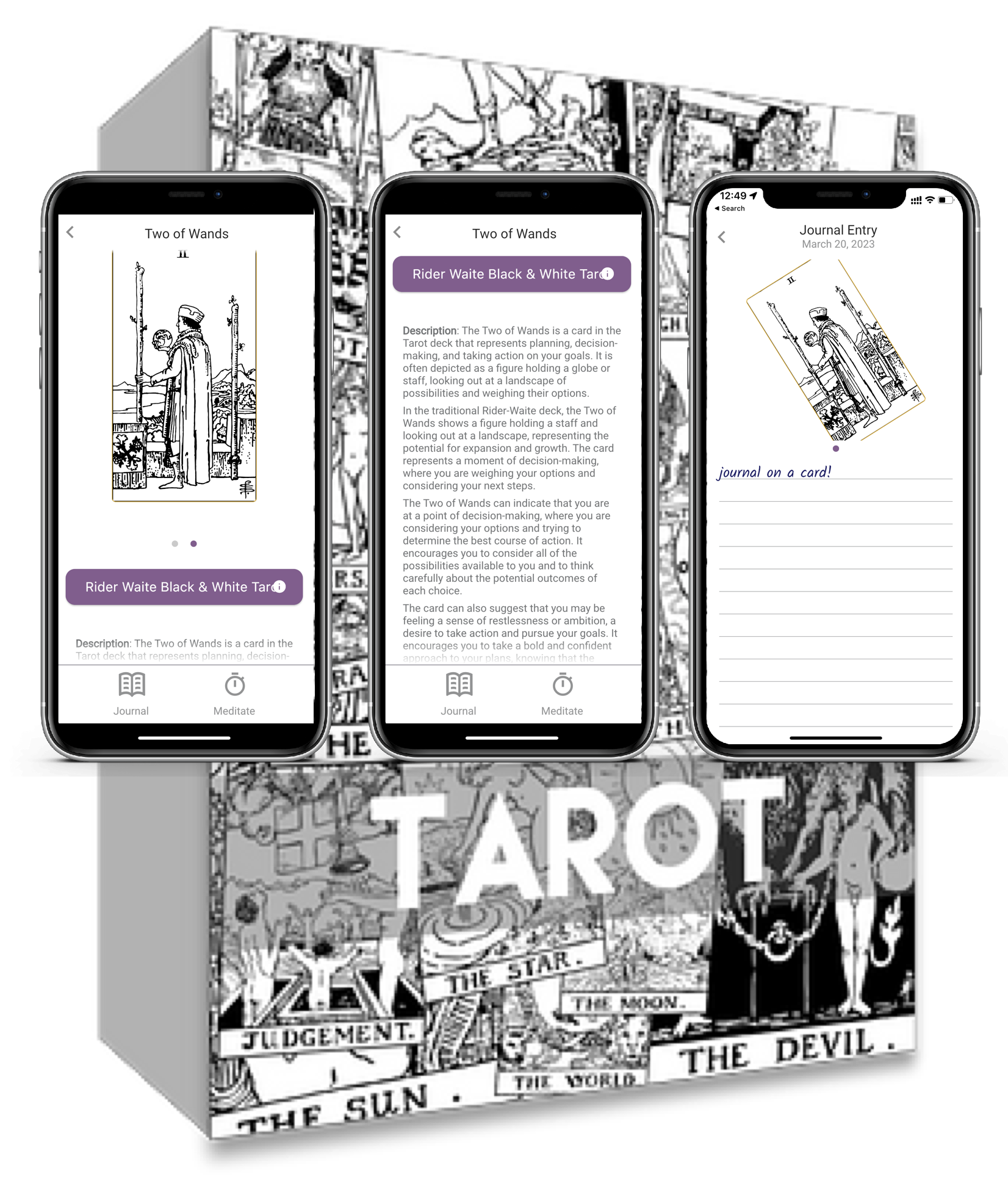
To compliment the new Tarot features we updated The Black and White Rider Waite Tarot Deck. It now includes full rich descriptions for each of the 78 cards in the deck.
We made this deck a free deck for new users. We dropped the Unlurk Me deck from the free decks to keep things simple/compact.
https://www.deckible.com/card-decks/n-rider-waite-black-white-tarot-tarot-in-black-white-rider-waite
The Launch Deck (42 deck idea) is the 2nd free deck.
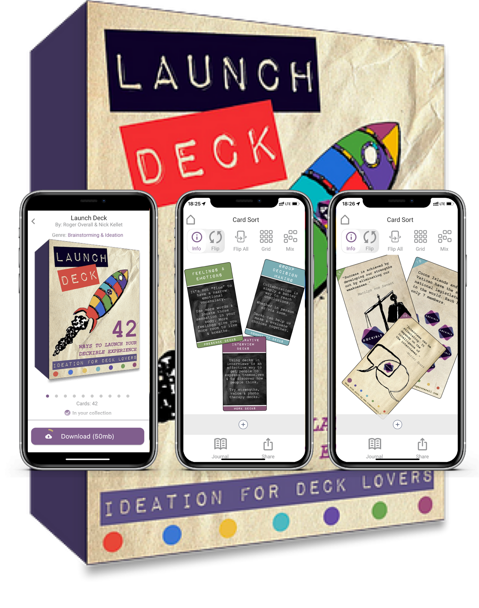
https://www.deckible.com/card-decks/BS-launch-deck-42-ways-to-deckible-roger-overall-nick-kellet
8. Try Before You Signup.
We've added the ability to play with Deckible and these two decks without the need to sign up.
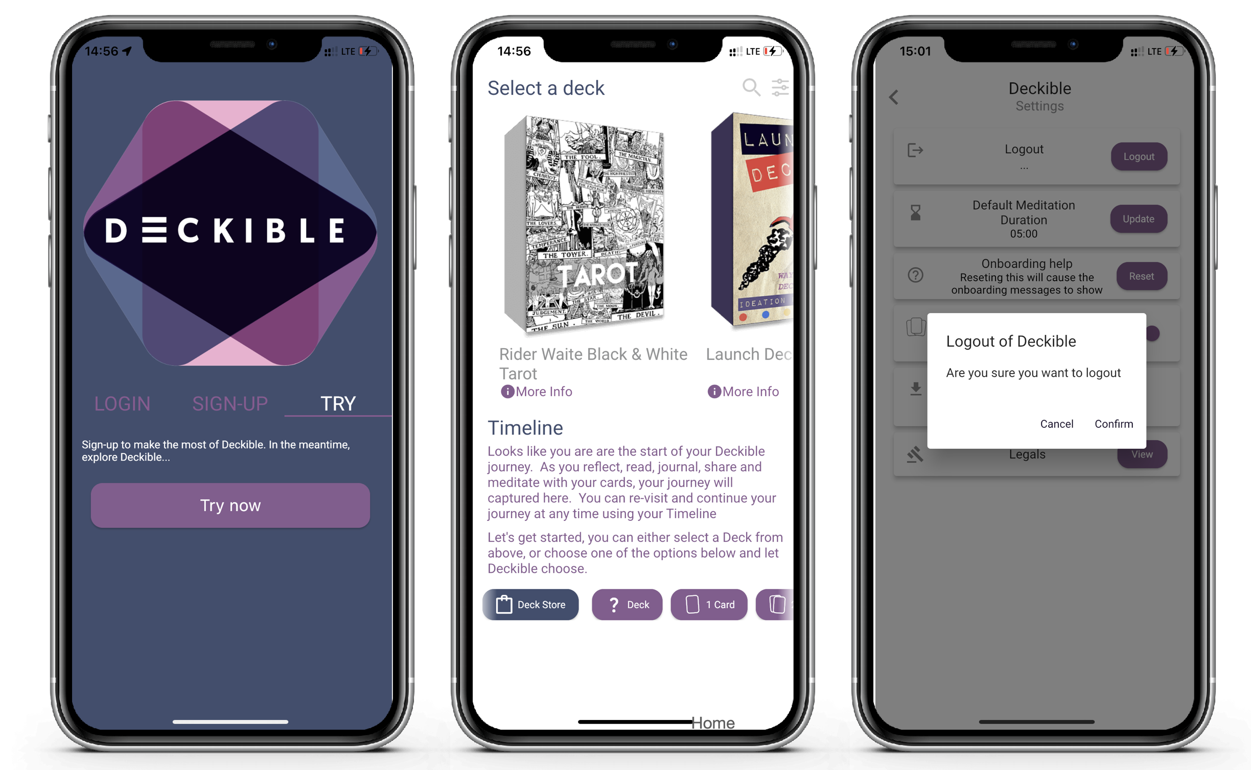
We know people hate to be forced to sign up to try something. People can interact directly with these two decks from the moment they install the app, without the need to sign-up or wait for artwork to download.
Click on the Tarot deck, choose a spread. I choose past present future.
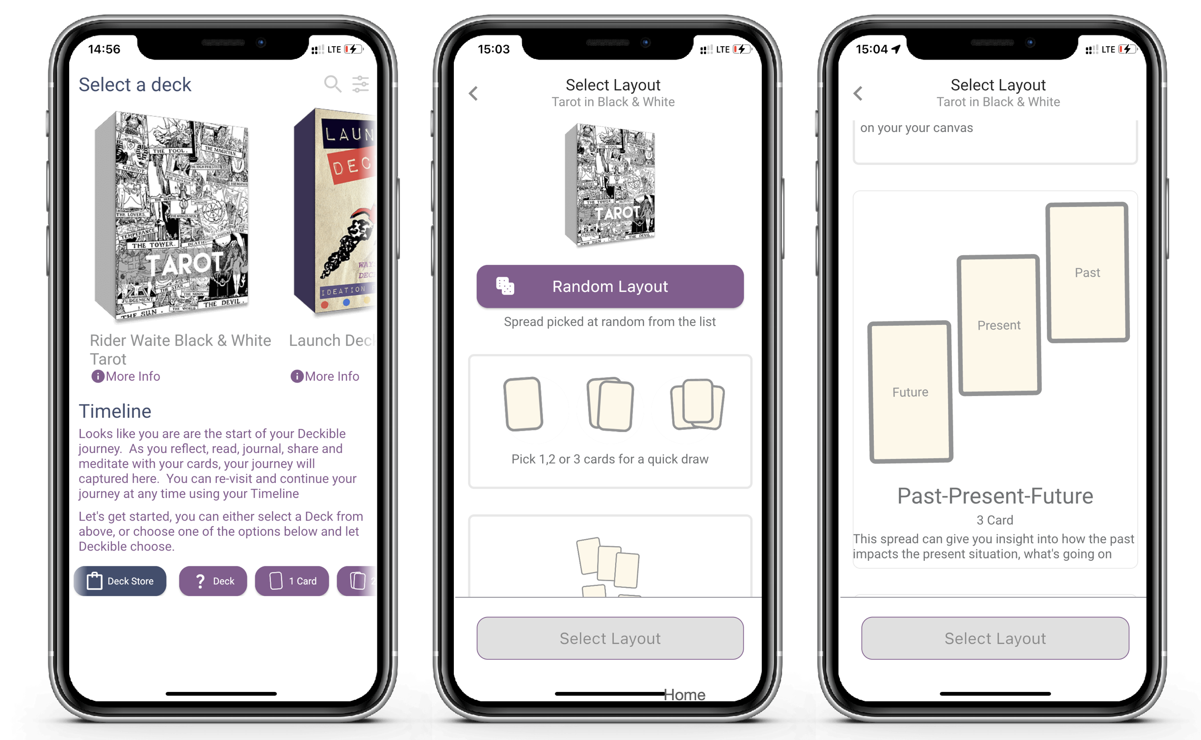
Then I get to choose the cards by hand. I can also shuffle again at any time. And I can opt for a "quick draw" to have Deckible choose a card for me.
Finally I hit reveal. And now I can click on each card in the spread. Once to put it in to focus, a second time to flip the card. Or click Flip All.
The reading for the card is displayed below for the focussed card.
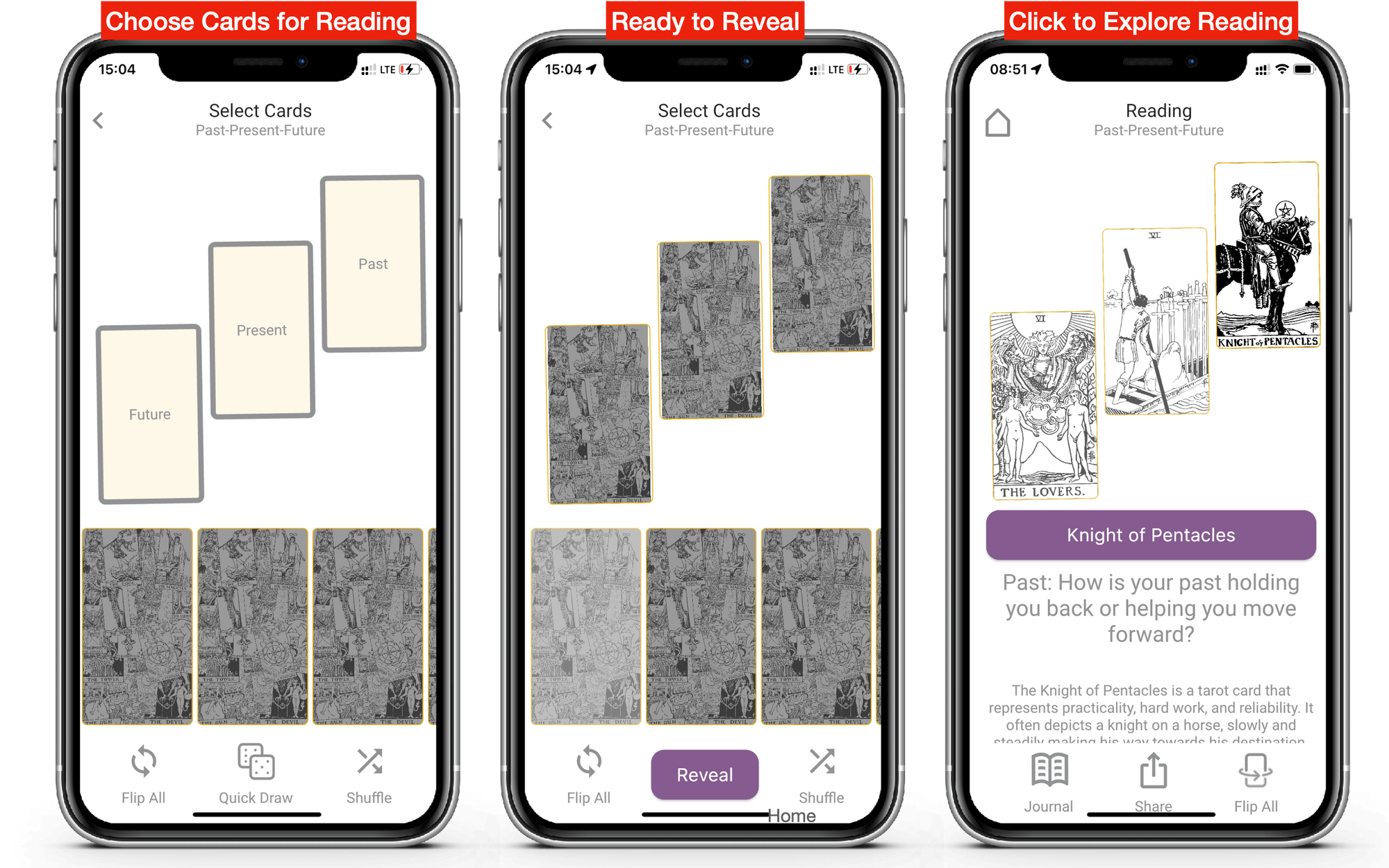
User interactions with these two decks (for non-signed up users) are not saved, so they effectively begin again when they sign-up and login for real,having been able to try the Deckible experience with no commitment.
When you are ready to sign-up just go to settings (Slide right when your see "Deck Store" ) and click Logout. And you can now sign up from within the app.

9. In-App Sign-Up
We've enabled sign-up to Deckible.com via the app.
When you do so, you will receive a confirmation email. You email must be validated before login. So, now you don't need to go to Deckible.com to create an account first (you can, but you don't need to). This is one element of improving the onboarding experience.
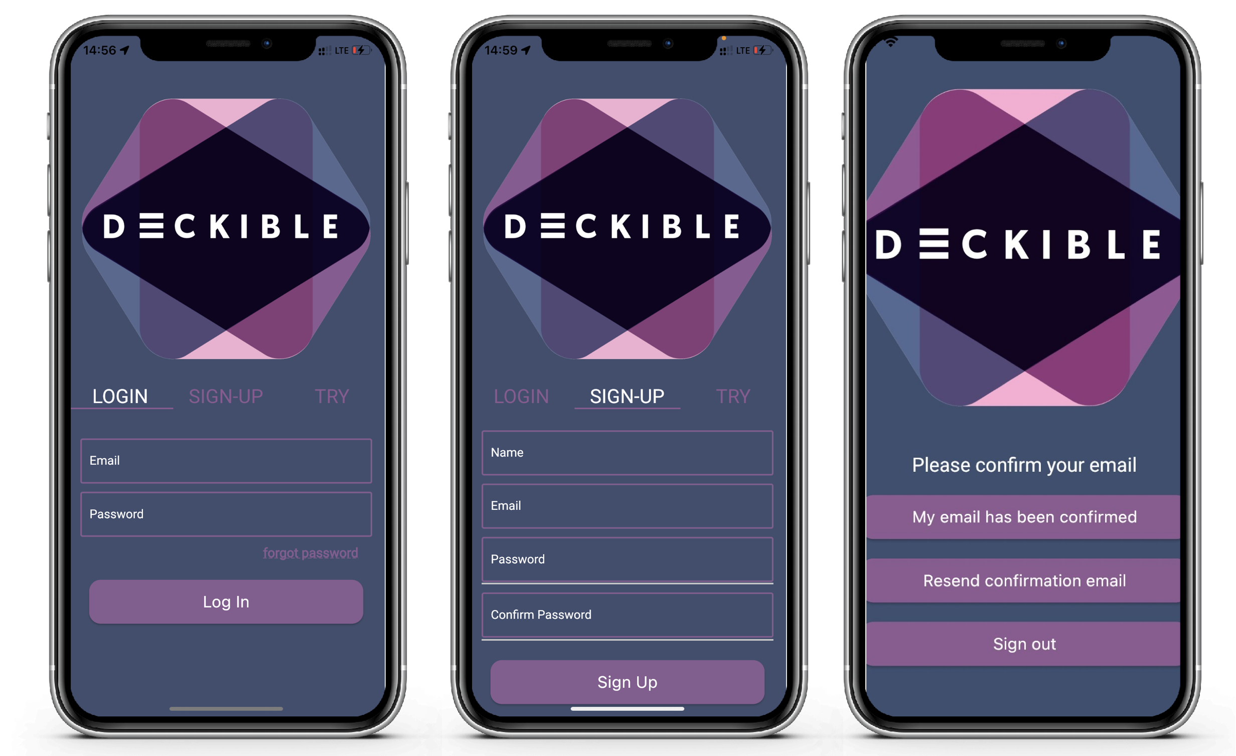
- Just click signup. Complete your details.
- Then go to your email to confirm your email.
- Then click to confirm that your have confirmed your email.
- You will then then be logged into Deckible on your phone/tablet.
This is very slick.
You can login on multiple devices on Android and IOS and your timeline of reading are synchronized.
10. Simpler Home Page / Timeline
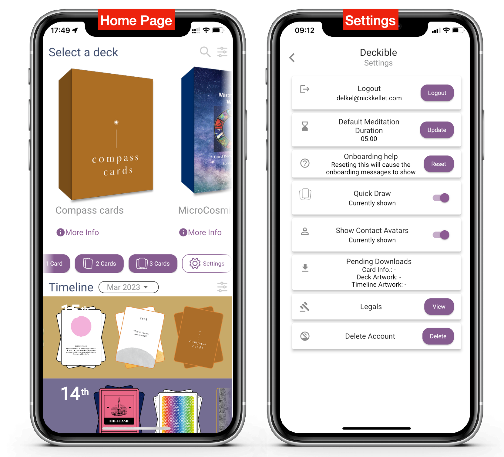
We made it simpler and gave the deck more room.
- No Random Deck option if you don't have multiple decks (surplus) - now called "? Deck"
- We are re-naming of Marketplace to "Deck Store".

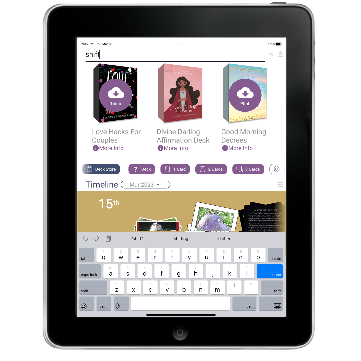
- We also blended "quick draw" and the "settings" buttons into a horizontal scrollable list of options shown below the decks. In this case quick draw will choose 1,2 oe 3 cards from a random deck (one you have downloaded already).
- Settings lets you turn off quick draw on the home page.
- There is a new option to "Reset" the onboarding messages, that only appear once. This is part of creating a progressive onboarding experience.
- We added ordinals (1st, 2nd, 3rd etc) the dates in the timeline. Enough people missed that the number represented days or the month that it was worth making that change.
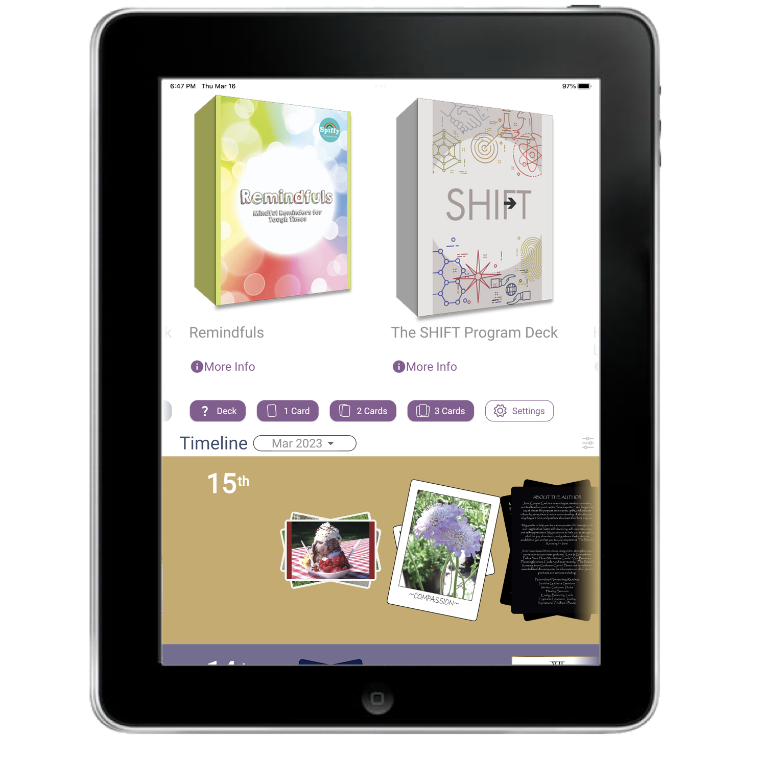
- Initially, we show your decks in a bigger size (see above) when you begin, as the focus is on the decks (and you have no timeline). Deck size shrinks if you search to make room for the keyboard. (see below).
11. In App Usage Metrics
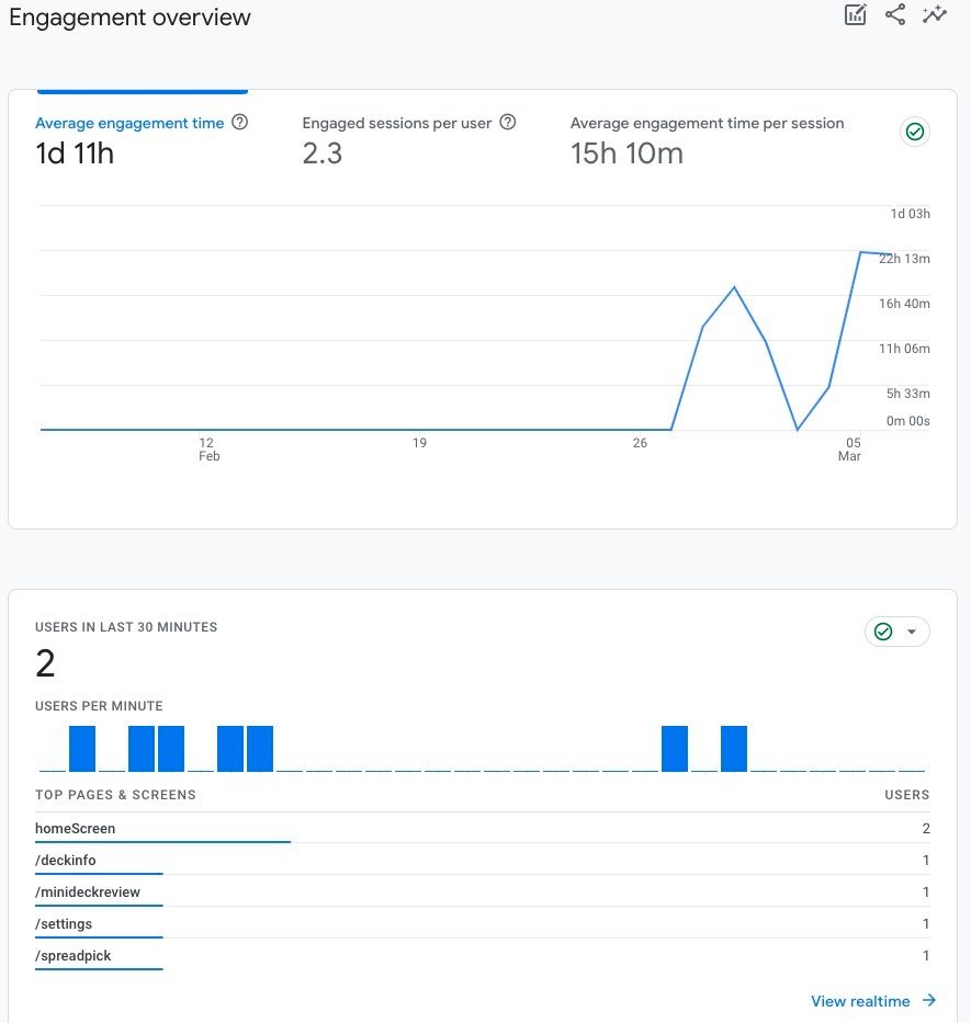
We have added metrics to let us track key workflows. We will now prioritize based on data not hunches, enabled via Google Analytics.
12. Public Sharing Update
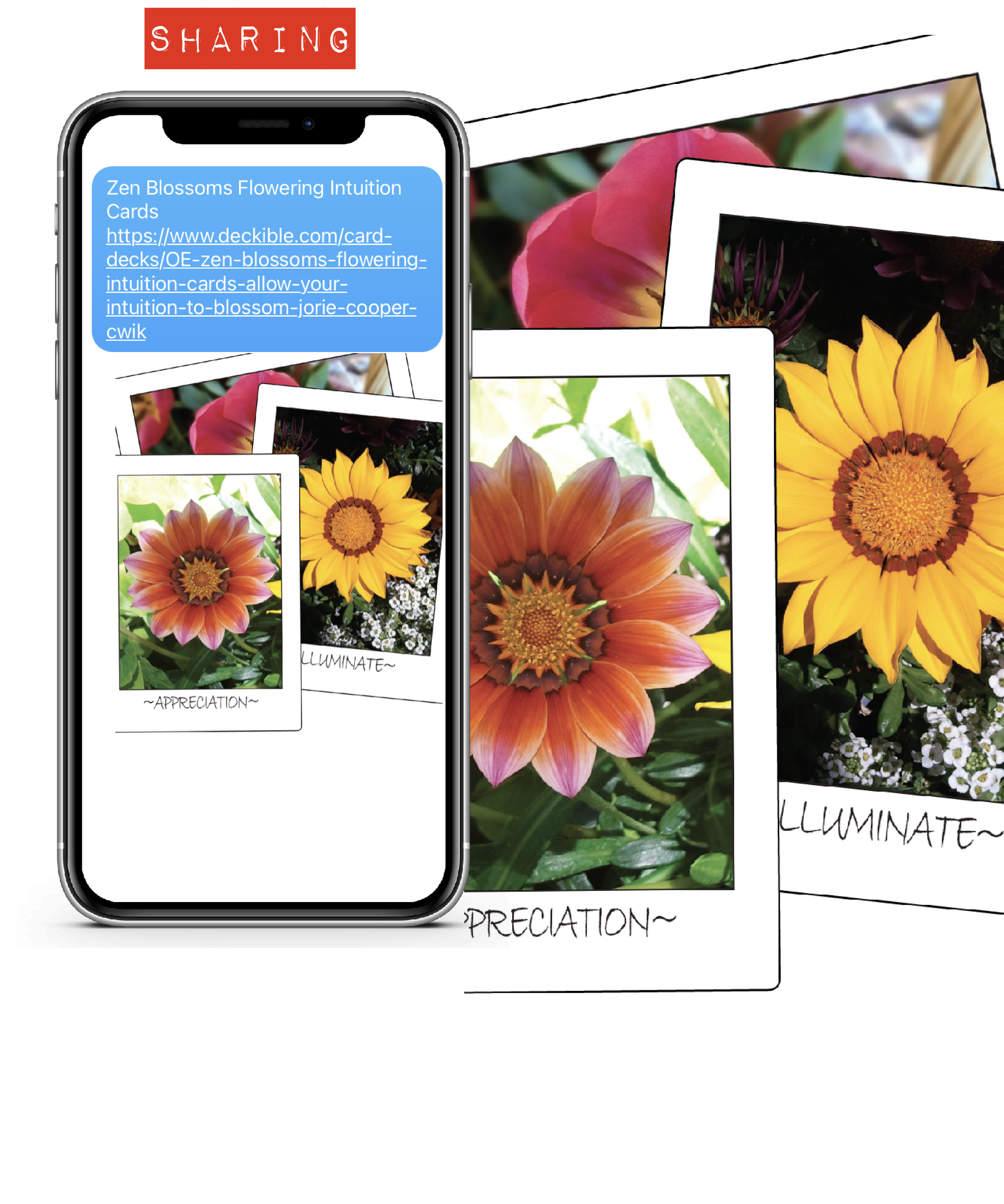
We added public sharing in the last release, but there were a couple of issues.
The images were pixelated and we were missing the deck URL & name.
These are now fixed.
13. Downloading Decks
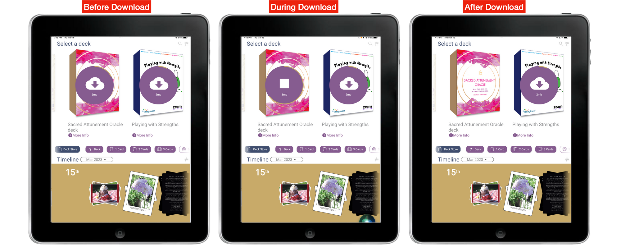
In the last release we updated the method for downloading, but it was possible that the download would fail. In this release we've included error checking, so now the download will complete every time, just so long as you have consistent wifi. Predictable is good.
Here's how it looks before, during and after downloading
14. Are You Using the App ?
We'd love to hear about your experience. What do you like? What's missing? What's annoying? What are you waiting for?
What's your Deckible daily ritual?
Are you journaling with Deckible? What's stopping you?
What is it you want from Deckible? What's missing? What else are you using and why? We'd love to hear? feedback@deckible.com
15. Deck Meta-Data
There have been many changes to the uploading process since inception. The "checklist feature" has evolved and will continue to do so.
Looking back at decks that were approved early on, we can see things that need polishing in the meta data.
So it's likely we need to a full check of all 400+ deck.
tSo don't be surprised if you see an email asking for changes to be made to your deck or just notifying you that we have changed your deck to correct errors.
It is likely creators may want to update and extend the spreads they offer with their decks with all these updates.
Creators, please use your deck in the app and experience the spreads before submitting your deck for publishing.
Guidebook Cards
Some creators have tagged all the cards are guidebook cards. This is bad. Mostly this means there is not content to shuffle and that's confusing.
You will need to update your deck. We will be adding checklist items to fix this.
16. Social Media & Deckible Instagram Accounts
We have been much more active in the last month on Instagram
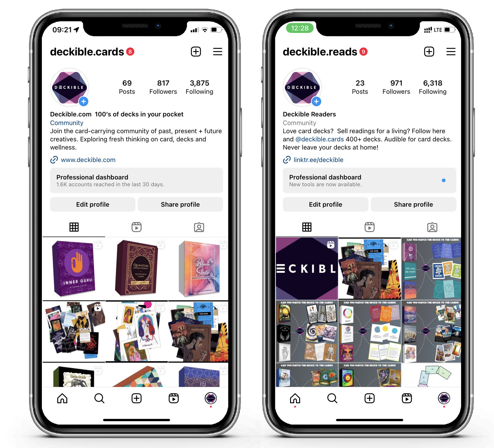
For Card Deck Creators
https://www.instagram.com/deckible.cards/
For Readers and Consumers of decks
https://www.instagram.com/deckible.reads/
We'd appreciate if you follow along ansd liking lots of posts. We've been featuring lots of decks. Please like posts for other decks too. This is a community where we support each other.
We aim to keep the two feeds unique. So it's worth following each one.
Here's a fun ideas we've been exploring on @deckible.reads. Match the card to the deck.
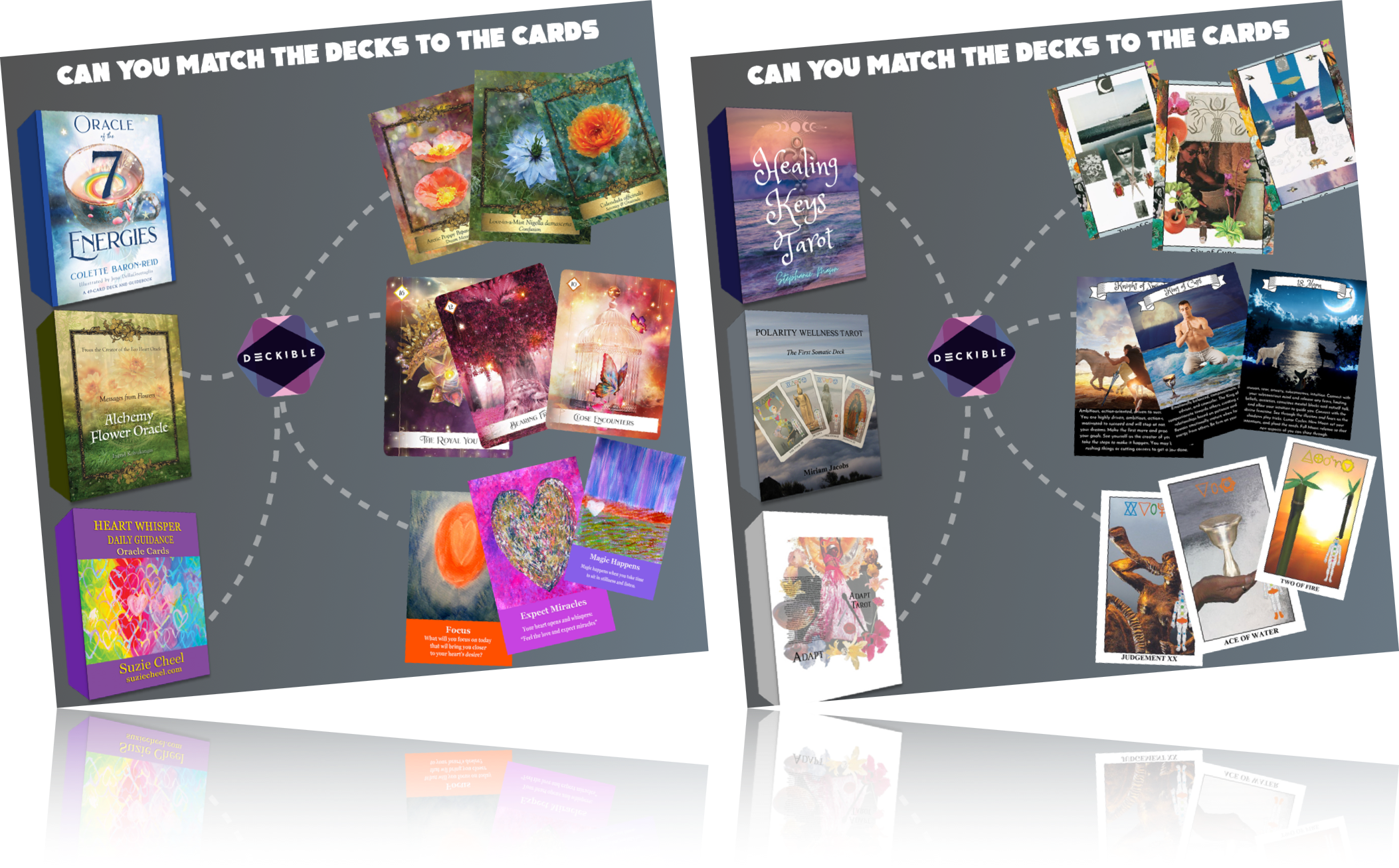
And some simple animations of 40 decks at a time on @deckible.cards

17. Deckible Reviews & Links to Deckible.com
If you have a blog, please write a post to share your thoughts on Deckible.
If you have a deck please link directly to your deck's public URL on Deckible.
With more links we will earn more SEO status, and that will help all your decks get found.
And we will help more creators and deck lovers find the joy of Deckible.
And of course if you'd like to write a review for IOS/Android on the app store, we'd appreciate that.
18. Android Version
The Android Version will now support 8.1 or higher. That is a reversal. In the last release we the Android version moved forward, which excluded some people.
We were able to reverse that.
19. Next Release
This is now in the planning stage. We will keep our focus on onboarding enhancements
Top of our list is offering people the option to trial decks and in doing so offering creators control.
- how long (how mny days)
- how many cards are included in the trial
There's many ways to implement "n day" trials. One of the most important features is limiting access to the deck once the trial is complete.
This is very normal for the purchase of digital content, especially for a new medium such as digital decks.
We'd love to hear your thoughts and will be communicating more once we have plans confirmed. feedback@deckible.com
