U17: Consumer Centric Update

Here's an update about 7 changes that happened over the weekend all focused on deck lovers and first time users of Deckible.
I was totally aware that we had not focussed on this. At some point you have to push things to go live or you never launch.
These changes are just the start. There will be more. These improve the experience is signing up and buying decks. I believe the deal with the most critical feedback I've received from all of you and from deck lovers directly.
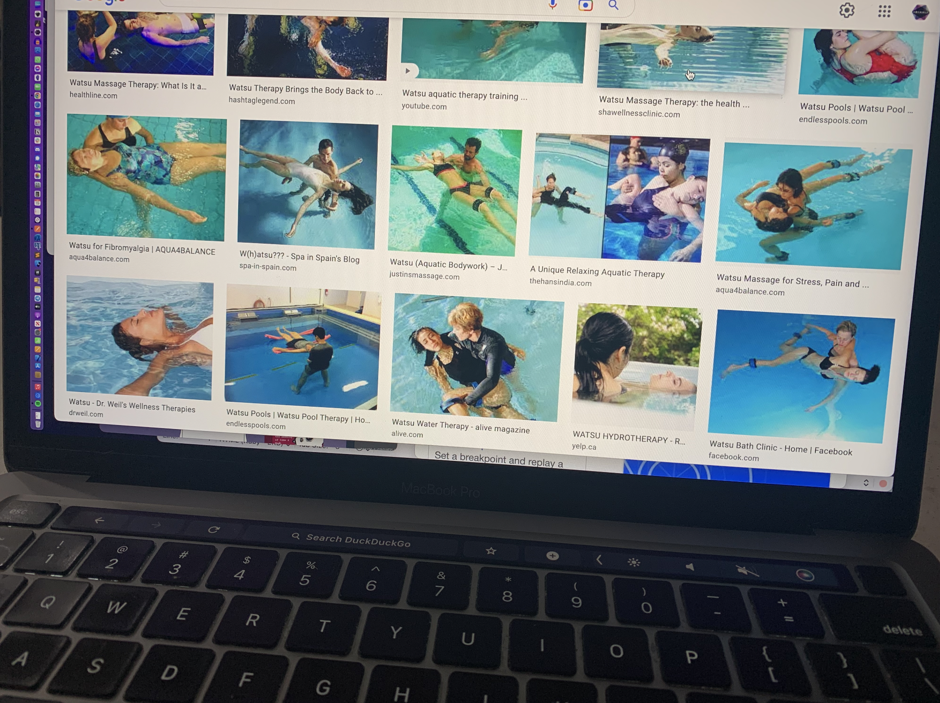
I managed to fit in two meaty hikes and some watsu therapy over the weekend. Watsu a wild thing. Google it! Quite an experience. I sure left a lot of stress in the pool.
So I'm feeling much more rested. And ready for next steps

SEVEN CHANGES
- Workflow changes
- Add to cart as a guest
- Signup and keep your cart.
- New Signup Email.
- Revised About Page
- Revised Contact Us form
- IOS + Android store links.
I'll details these below.
CREATING BIGGER DECK PIE
I wanted to explain an aspect of focus.
For now we have been 100% focussed on the creator. The core experience for the creator matters because if creators won't use the app, we have missed the mark.
I've had some wonderful feedback over the weekend as more of you dig deeper into the app to mediate and journal and to explore many decks.
I also got a bunch of emails about the experience of your friends/community as they step into Deckible for the first time.
I appreciate all the feedback I'm getting. And while I can't always respond to you all and when I do it's often brief, I want you to know this is welcome.
There are valuable data signals the help us prioritize fixes and future development.
When I think the card deck markey, I think of "pie" and specifically creating a bigger pie, I immediately think of slices. The top pie metaphor is slices.
And I realised what we are doing is more like the rings of Saturn. Concentric circles. I called them tiers in my mind, hence the "t", perhaps they should be "r" for rings.
We need to keep focused on t1 and begin to embrace t2.
t3 is real and large, but its off in the future. we will begin to find t3 people as they discover Deckible for the first time.
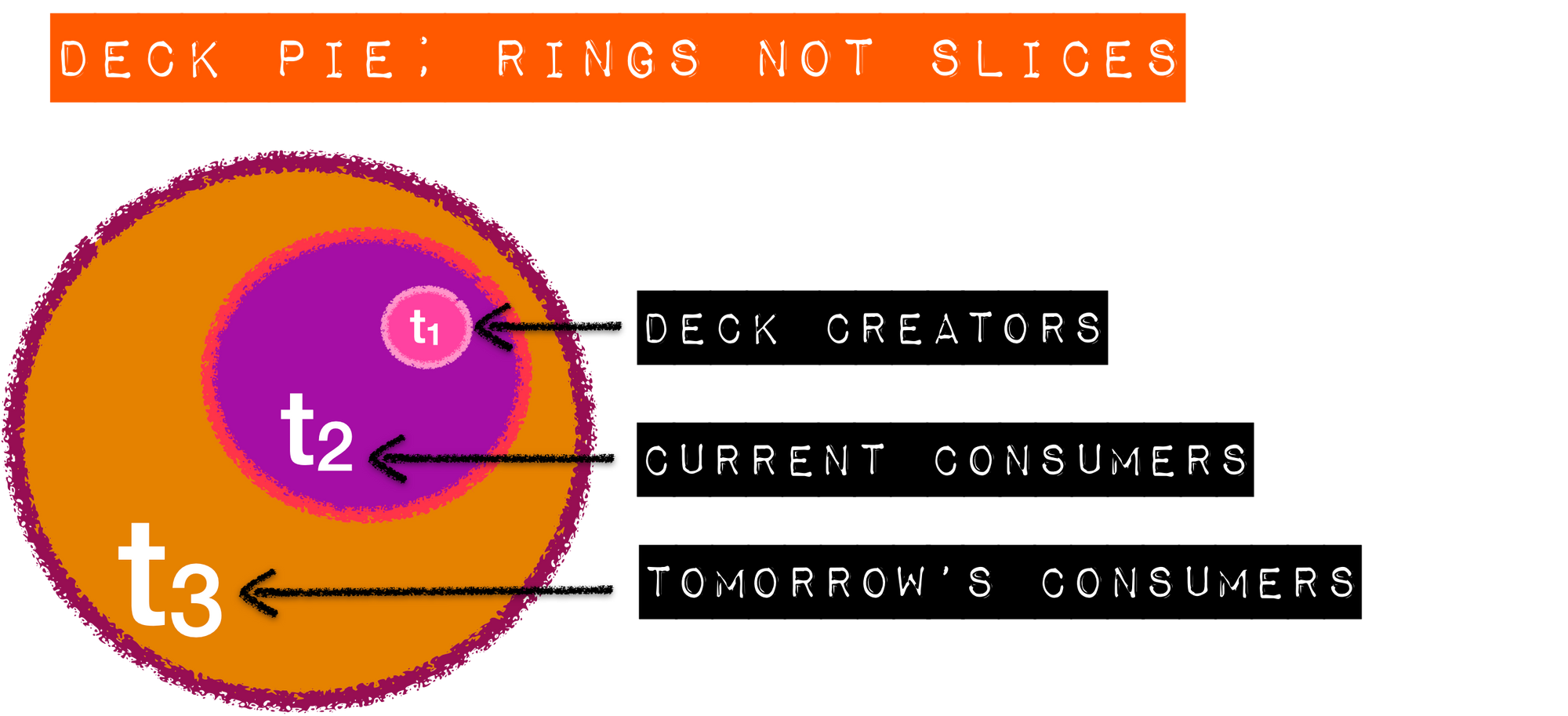
t1 - DECK CREATORS
t1 has been out focus this far. Getting to 600 creators has been challenging and fun It's just the beginning. We know there are easily 10,000 creators out there. Heck there are 30 people selling courses to create a bigger t1
Each new creator is now easier to bring on board. We have the tools, the words, the videos and the features to support them. We have status.
And each new creator brings a deck and an audience - i.e. more value to everyone.
More creators are a win-win for all.
t2 - CURRENT CONSUMERS (AKA DECK LOVERS)
Today's update is just the first step of embracing t2.
t2 is 1000 to 10000 times the size of t1, but they will be slower to adapt.
We need to listen to their experience and make smart changes to improve their experience.
We need to find the early adopting t2's, the ones willing to try new things
We need to make Deckible easier to understand for them.
More decks helps.
100's of things can influence this. Mostly time, adoption and FOMO.
We all need to make noise and touch people. Lets them hear about Deckible often.
We often heard of things many times before we try things.
How long did it take for you to try and Uber, an AirBnb and an Etsy.
Heck I know some people that have never tried Amazon.
t3 - TOMORROW'S CONSUMERS
This tier is into the future, but I lay out our stall here to highlight that we think the market for card-decks is way bigger than currently when you looks at the experience through a Deckible lens.
Digital has potential to explore in ways physical does not.
THE SEVEN CHANGES
1. Workflow changes
There were two identical pages before. One that required login, one that didn't.
That's all merged into one.
And there's lots of changes and integrations between the about page and the marketplace.
Just simpler, more logical. It feels much more complete.
That said there is more to do.
2. Add to Cart as a Guest User
Now you can add to you cart as a guest . A login is not required until you purchase.
3 Sign up and keep your cart.
As soon as you want to buy a deck from your cart, you are prompted to create an account. Your cart is maintained, so as soon as you confirm your account you are able to complete your purchase with one click.
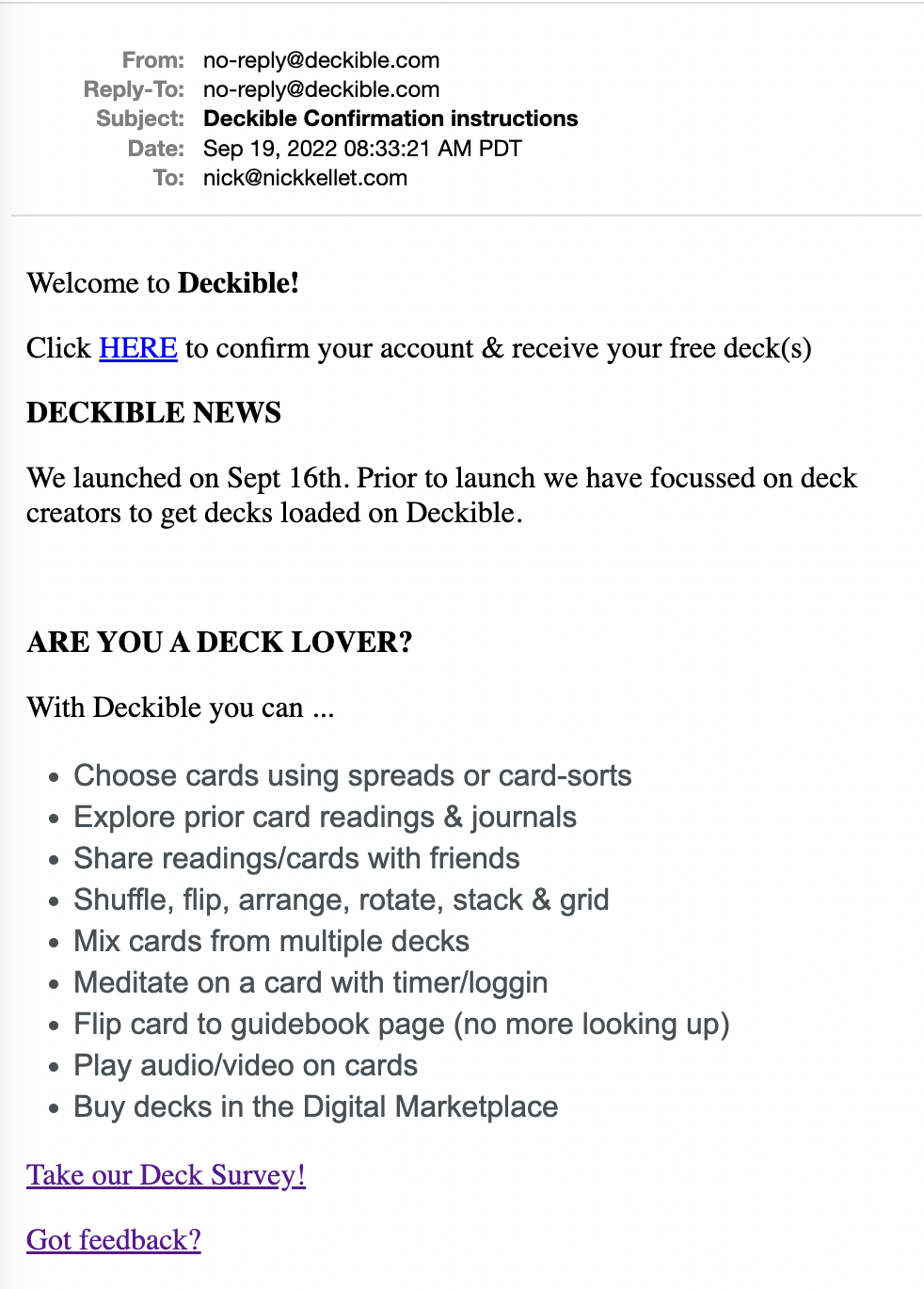
4. Update Signup/ Confirmation Email.
This email is now much more focussed on explaining the value of deckible
Then end of the email has the usual information for creators
5. REVISED ABOUT PAGE
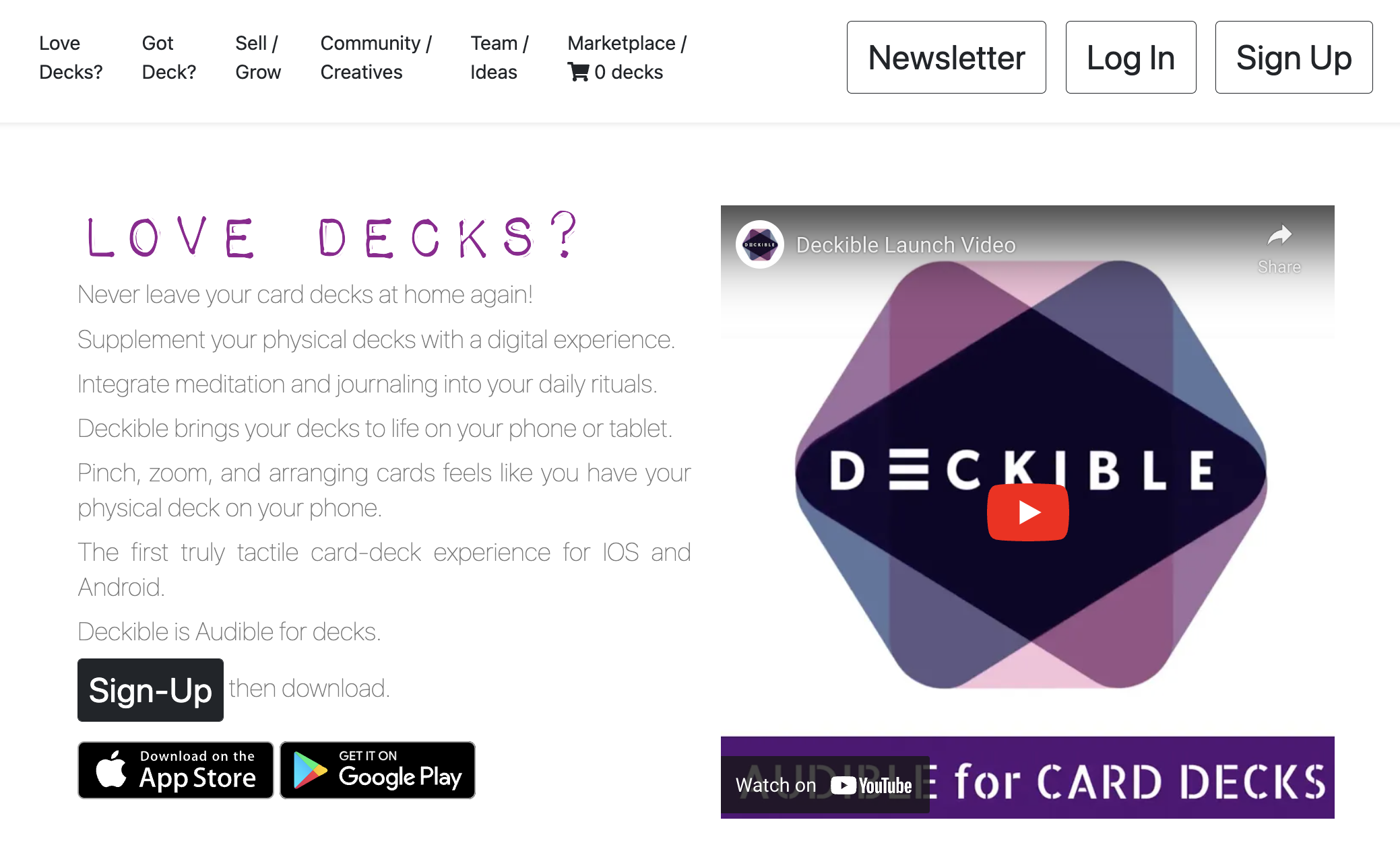
The about page now links to the marketplace and shows your cart items count.
If you are an existing user just click Log In
The top of the page is now focussed on Deck Lovers and not creators.
And it includes links to IOS/Android.
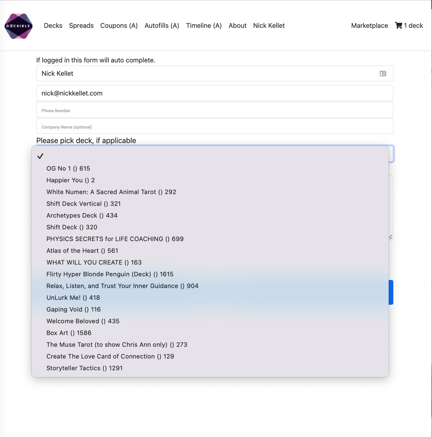
6. Revised "Contact Us" form
We now ask for a Deck if that's relevant.
This is just simpler and speeds up response
If you are logged in your details are auto-filled and you can choose from your decks
7. IOS + ANDROID store links
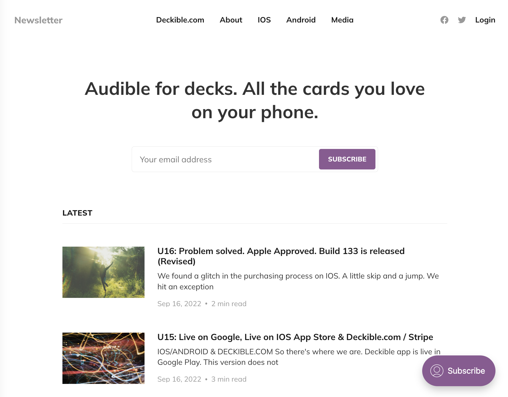
IOS Link
https://apps.apple.com/ca/app/deckible/id1594876295Android Link
https://play.google.com/store/apps/details?id=mobile.deckible.comThe links are also available from the newsletter home page
They are als on the about page
200+ CREATORS ON DECKIBLE COMMUNITY PAGE
That's a cool milestone. There's still a bunch of you that have not completed your profiles.
This page needs some design love and some filtering and tags etc.
DECK INFO PAGE ON DECKIBLE.COM
Top of my list is to bring the deck page in the marketplace up to parity with the Deck Info Page in the app.
ie to who front and back of box, to show cards etcv
And to generally look the same as the app
UPDATED SUPPORT PLATFORM
This is high on my list. Slack was too expensive.
I have a shortlist discourse is top of the list.

We used this at List.ly
CHECKLISTS & SET PRICING
Please check your checklists.
I've noticed some issues with earlier Decks. As the checklist has got better is highlighting more possible errors.
All good
I feel totally the the Checklist is an awesome feature for teach new users how to get moving faster. And to stay on top of any issues.
