Honing Deck of the Day Process

CONSUMER FEEDBACK
Things are going well.
I value your feedback, so please keep it coming.
Please tell me about the issues you friends faced or your clients. What browser, what workflow. What was the friction. I've made many small changes and some big ones. More to come.
Here's some examples to make it real:
- Marketplace button not visible on ipad (hides when smaller screen)
- Can't add to cart without a login. Now support guest users.
- Can't view information on a deck without the app. New Deck Info page on Deckible.com
- Can't find my deck in marketplace. Now findabable
- New users have a "+new deck" button in the footer menu even if they are consumers. There is now a context specific menu for consumers.
- UX for community page - buttons too close / too many (feedback from Google). It was getting busy. You now click to the users landing page for more info.
- Pay button on ipad was in the footer scroll bar. Needed to be bigger and have more padding.
- "Create of consume" selection was ugly and confusing. It's now called build or buy and it's a little cuter. Marketplace, Community & My Decks are footer menu options - mentioned above
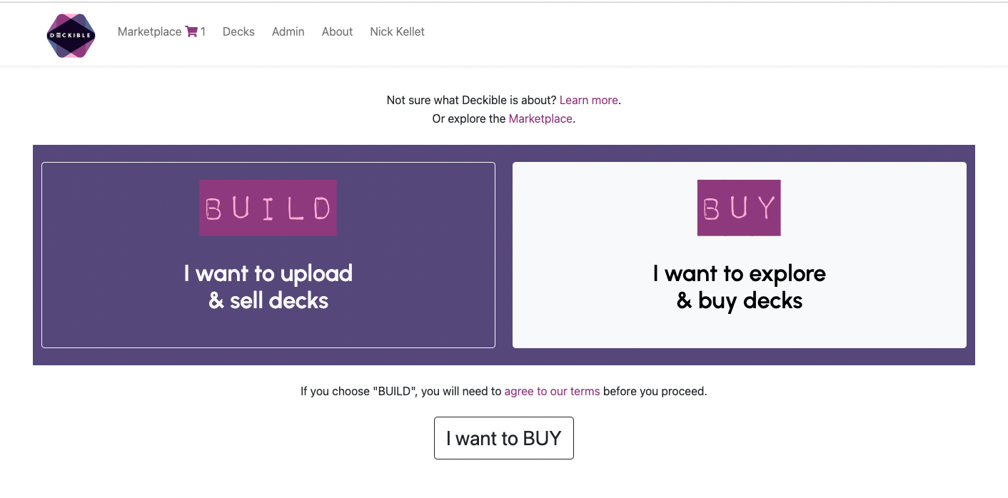
Much of this is device specific , but also it's true we were very "Build" centric. To be expected, but now we need to be much more "build or buy". I sense this will keep evolving with feedback.
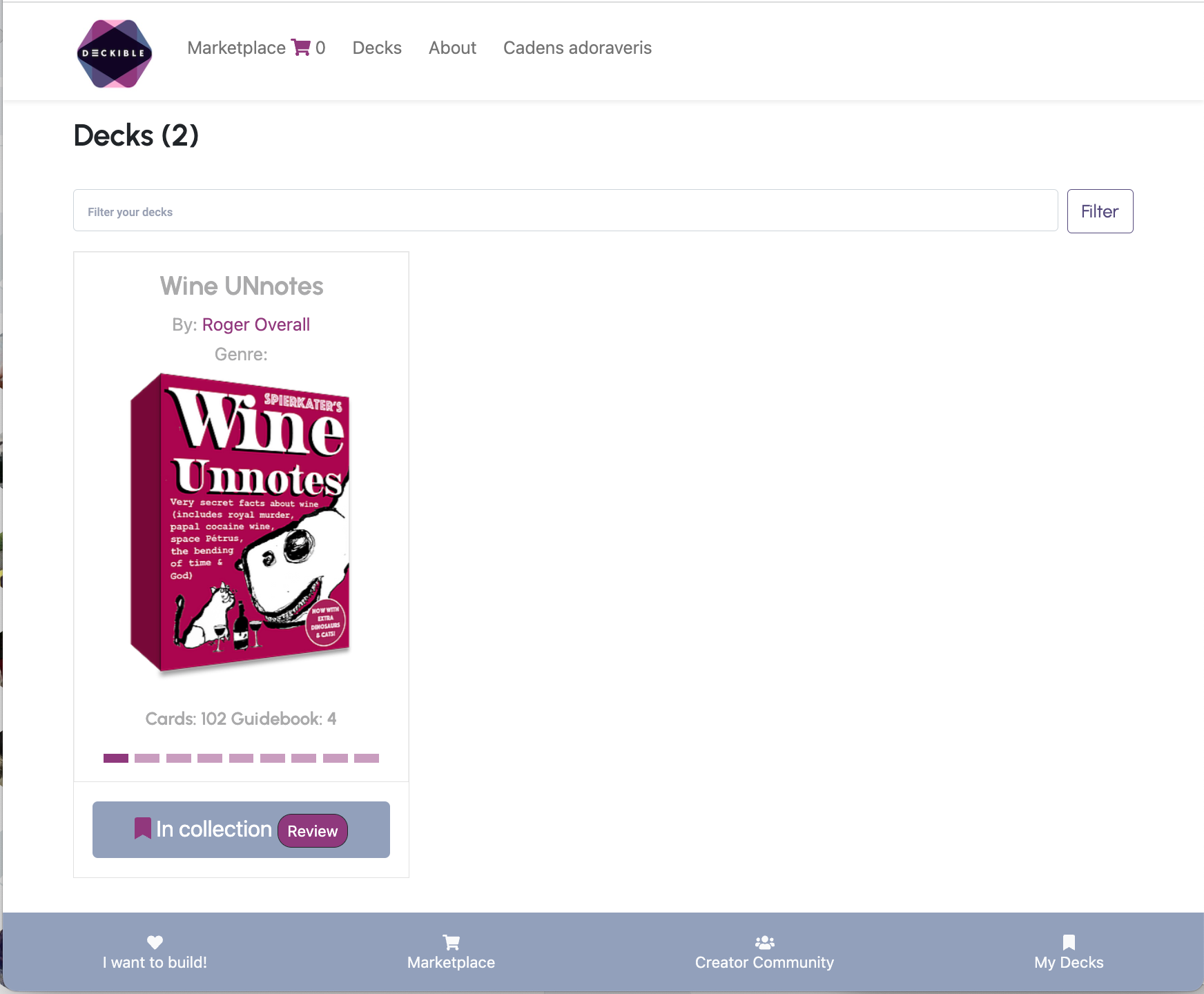
Notice the consumer centric footer menu. This is new.
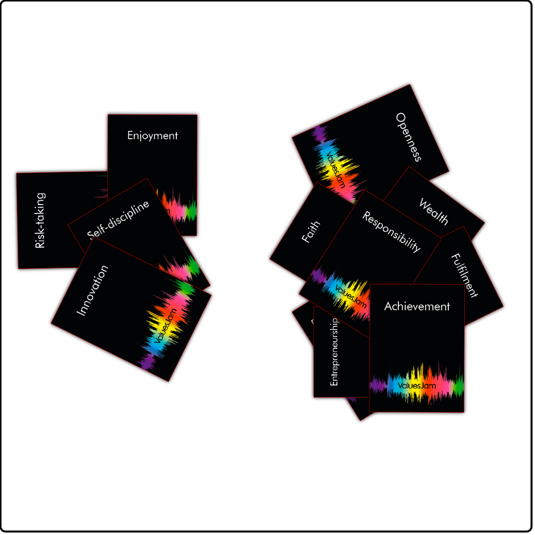
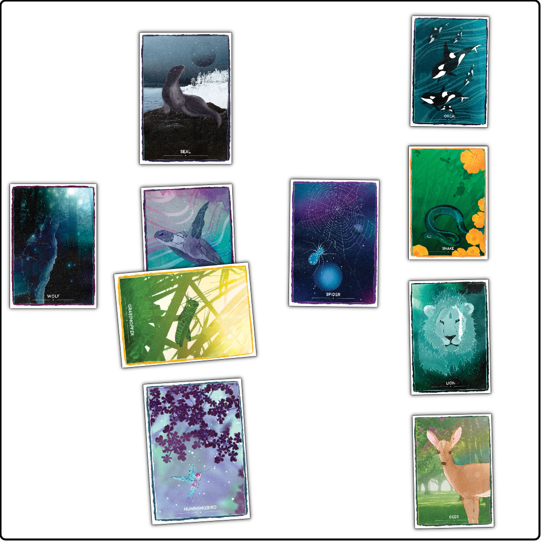
Here's a couple of images I auto generated in 10 seconds.
Read on to see how.
FRICTION IS THE ENEMY
The good news is that your feedback is focussed on relatively few things.
A handful of small projects have emerged as priority. We are sequencing those projects to make sure we bite off too much. Nothing worse than software indigestion!
Please speak up if you thought don't represent what I'm saying.
SUPPORTING THE COMMUNITY
Have you bought a deck yet?
I'd be curious to hear why not.
We can't all buy all the decks, so it sends signals and builds a better platform.
More purchases, more reviews. These are the building block of platforms like Amazon and Audible. Data. Data. Data.
It's one of the signals I listen to when prioritizing work.
We can all learn from creators. You can post reviews on their decks, they can do the same on yours. You can only review decks you have bought.
Act like you want other to act. Buying decks, using decks. If we aren't authentic card deck users and consumers, then it's not authentic, in my humble opinion.
Community norms and behaviours matter. We are here to support each other and to promote card decks to the world. If we don't start this culture now, we won't embrace it later. It matters.
Neither I, nor any of you individually, can shape this. It's a collective act. That involves support, sharing and caring for each other and for the card deck industry.
I value the people who share feedback, buy decks and use the product daily. Please share your experience.
Many people who have gone out of their way to gather feedback. They tell me about how they promoted their deck / Deckible to their clients and then shared the feedback their clients gave them. These people are committed, supportive & caring. This is effort & it's deeply valued by me.
And we are at the beginning of a long journey. We are creating a new category. Digital decks do more and we need to teach people why that is so.
DECK OF THE DAY
Deck of the Day has proved to be a lot of work. No surprise, really.
Some of new projects we have prioritized are about making it simpler to process and more appealing to receive.
I want the "Deck of the day" emails to be consistent and well styled (the current version is just text vs stylised HTML.). I'm talking about the emails you receive from Deckible.com directly and not via this Newsletter.
This is our blog (aka Newsletter). It's perfect for sharing thoughts and plans and updates. I'm using the Ghost blog platform and it makes stuff simple to create and send. I want to feel the same about the process of managing Deck of the Day on Deckible.
Deckible as a platform that will grow have millions of users needs to be able to deliver simple scalable beautiful emails. We have all the data on Deckible to craft custom emails based on the decks that are on specials on Deckible. All very simple, it's just work. We have unsubscribe options on Deckible, so this is also valuable data source.
Hence for the the remainder of the 42 day countdown we will not count weekends or Mondays. The countdown will simply take longer to complete. Just as its meant to be. That gives us more time to learn and more time to adapt and fix and tweak.
Deck of the day is an awesome concept, so it's not going away. We also need to grow our email list to make Deck of the day even more effective.
SELF CARE
I've found myself working crazy hard. I want to free up more time to focus on the changes that makes "Deck of the day" quick, fun and easy.
I was tired over the weekend and paused to feel my resistance. And this is what emerged. A slow and steady wins the race.
NEW COMMUNITY PAGE
It's simpler, and we now feature 4 creators not three. We will soon add searching and also breaks down creators by genre.
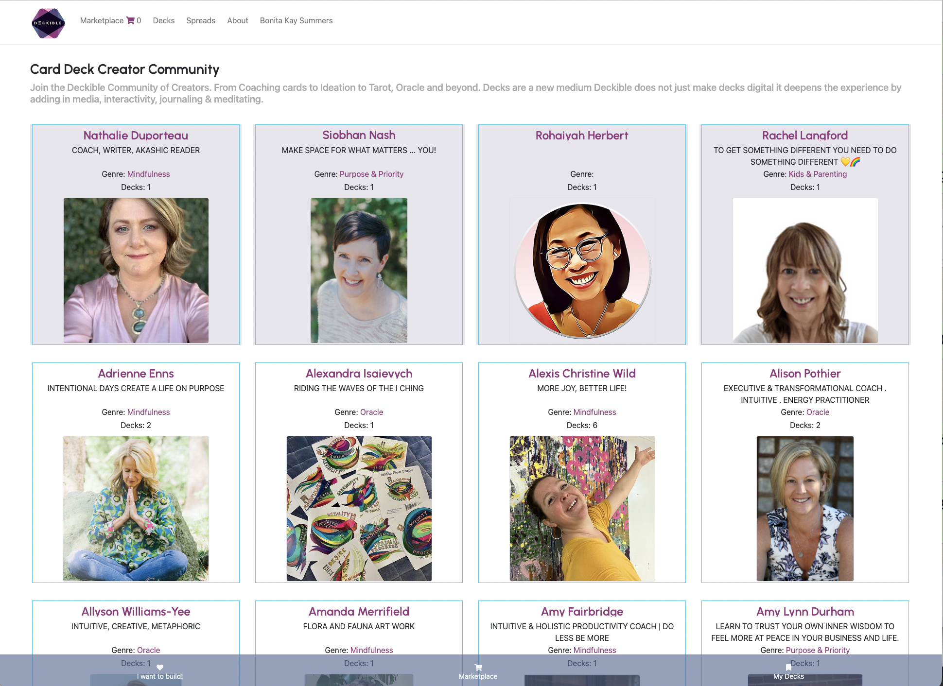
GENRE PREFERENCES
We will also be adding the ability to choose the genres you wish to see. This let's you exclude any genres you are not interested in.
PROMOTE & SHARE
This is new. There's a button on the checklist page. It's only an option once your deck is published
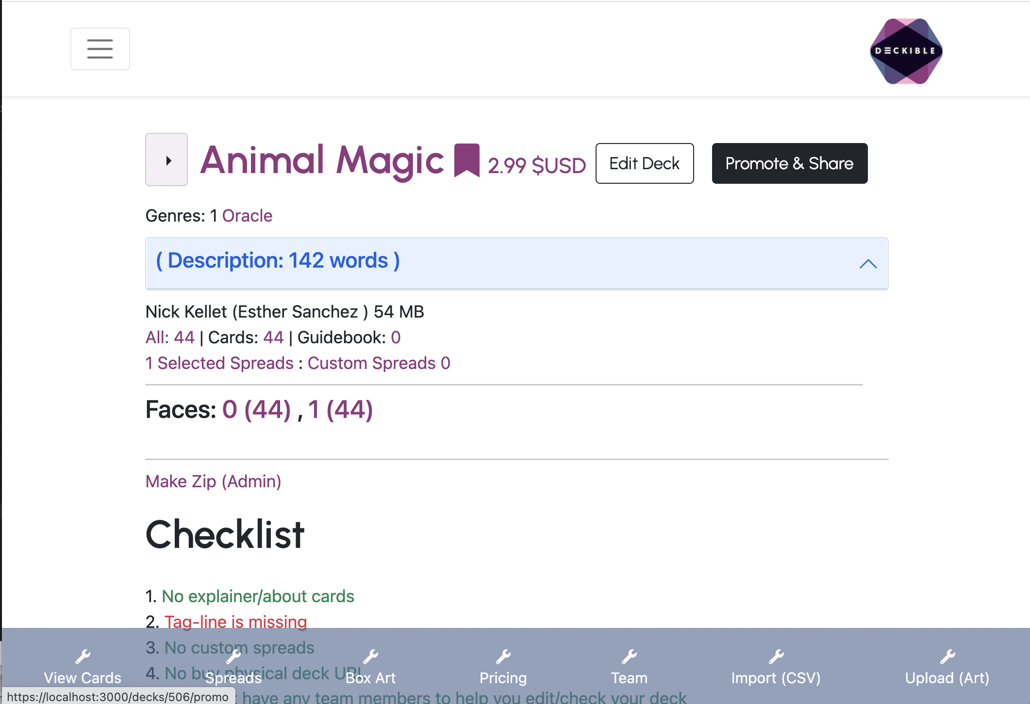
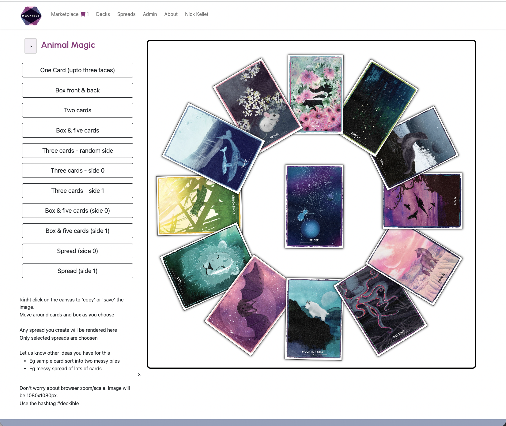
It's functionally rich. I think it's simple to operate. You can right click on the image to copy it to your clipboard and share it with anyone.
I got the image above in one click. And here is it! Wow!
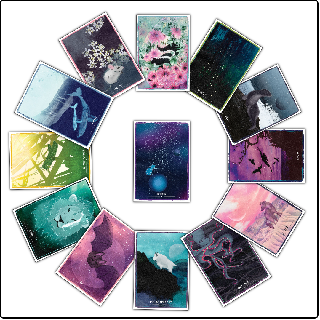
There's half a dozen options and that expands for decks with many sides. Each time you reload the page, the cards are picked at random.
I think that' pretty stunning.
This is part of "Deck of the Day" automation, but it benefits all of you.
So enjoy. Experiment and give us feedback
Share with the hashtag #deckible. What will you create?
VIDEO
Just to remind you video is supported by using only YouTUBE and only the video ID. I've explained this in full in prior posts.
Video will become a checklist item. I think it's a really strong feature.
GUIDEBOOK
I will soon write a post on the guidebook feature. Lots of questions here.
I think having a guidebook is respectful. It gives people a place to begin when learning your deck.