New App / New Team / 400+ Digital Card Decks on Deckible Platform

We're excited to share the release of the next version of Deckible.
There's some significant changes beneath the hood, hence it's taken a while to complete.
We've also added a bunch of decks too. We now have over 400 decks.
This release completes the following features:
- Quick Draw by Suit (existing creators will know what this means).
- Public and Private sharing.
- Quick Draw on Spreads.
As normal, it will be today for download on IOS and Android.
Moving forward we aim to have shorter release cycles of around a month and our initial focus will be on remove any friction in the onboarding process and to simply deck promotion. Public sharing makes this really easy right now.
We will be publishing more on our future plans in the coming weeks.
Here's an explanation of all the changes in the releases:
Deck Download speed
We have reworked the way decks are downloaded.
With good wifi, a deck can now be downloaded in seconds.
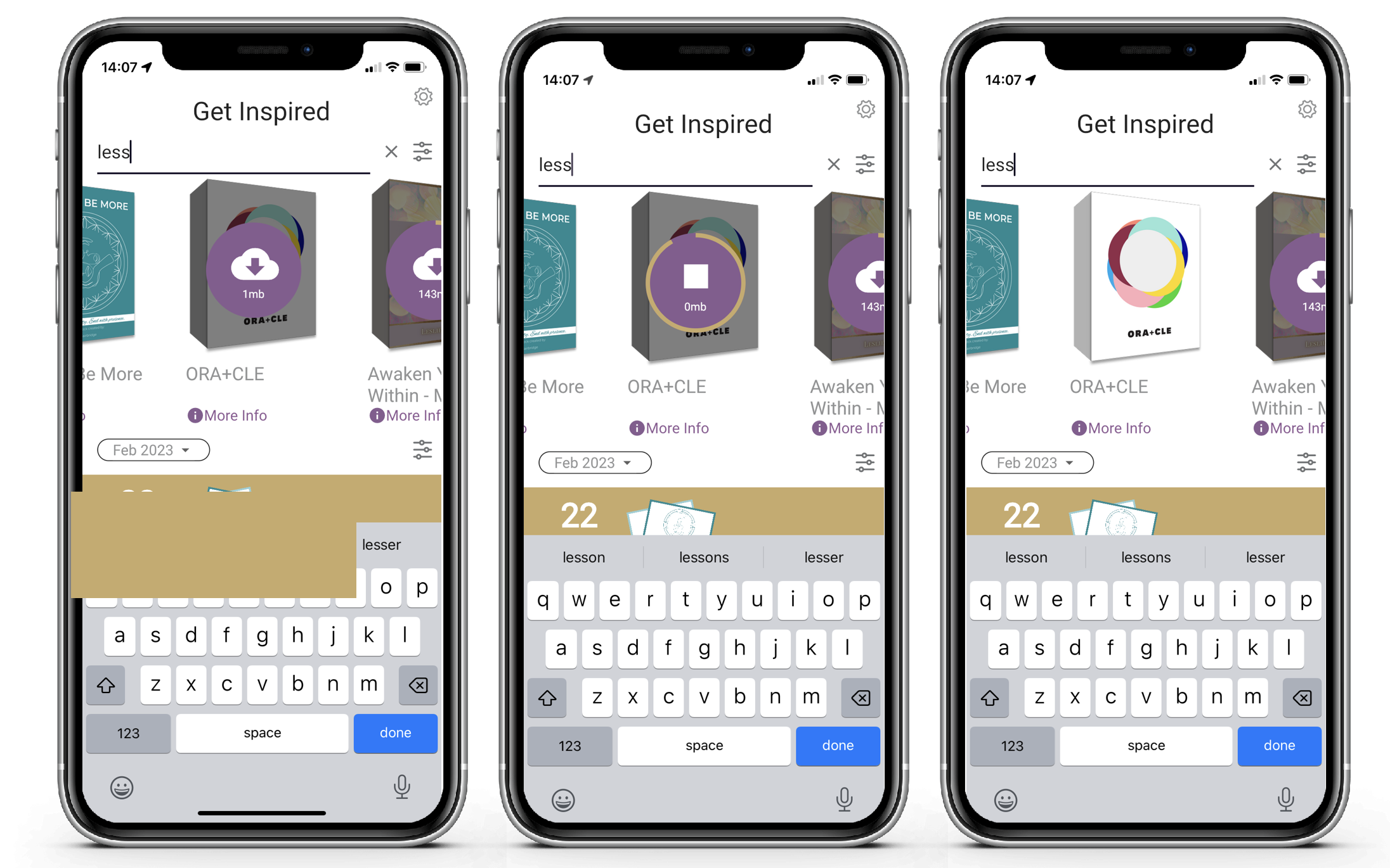
To initiate a download, simply click on the deck. Once downloaded, the download icon will no longer be visible.
First it downloads a zipped artwork file (upto 90%), then it unzips the files (the last 10%). You can see these two steps in the circular progress bar.
It can fail because the zip did not download perfectly, due to wifi issues. In this case the progress bar will reset and it will try to download the deck again.
It tries twice, before reporting a data-quality issue. If you get this message, you can simply try again or try later.
You will notice a dramatic difference in download speed from the prior version, but that difference is dependent on your data speed/quality.
Updating Your Deck
Because we now zip the artwork, you can't just update your deck and expect people so see the changes in the app.
A zip is auto-generated when your deck is published.
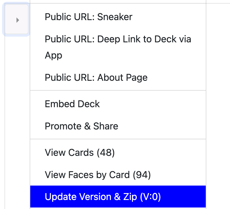
A new zip must be created and this is achieved by then "Update Version & Zip" on your deck menu on Deckible.com
This is only an option for published decks.
If your deck is in draft, the download won't be zipped and won't be as fast.
This will ensure users will download the new version. Use this with caution.
Multi-Draw (for Suited Decks)
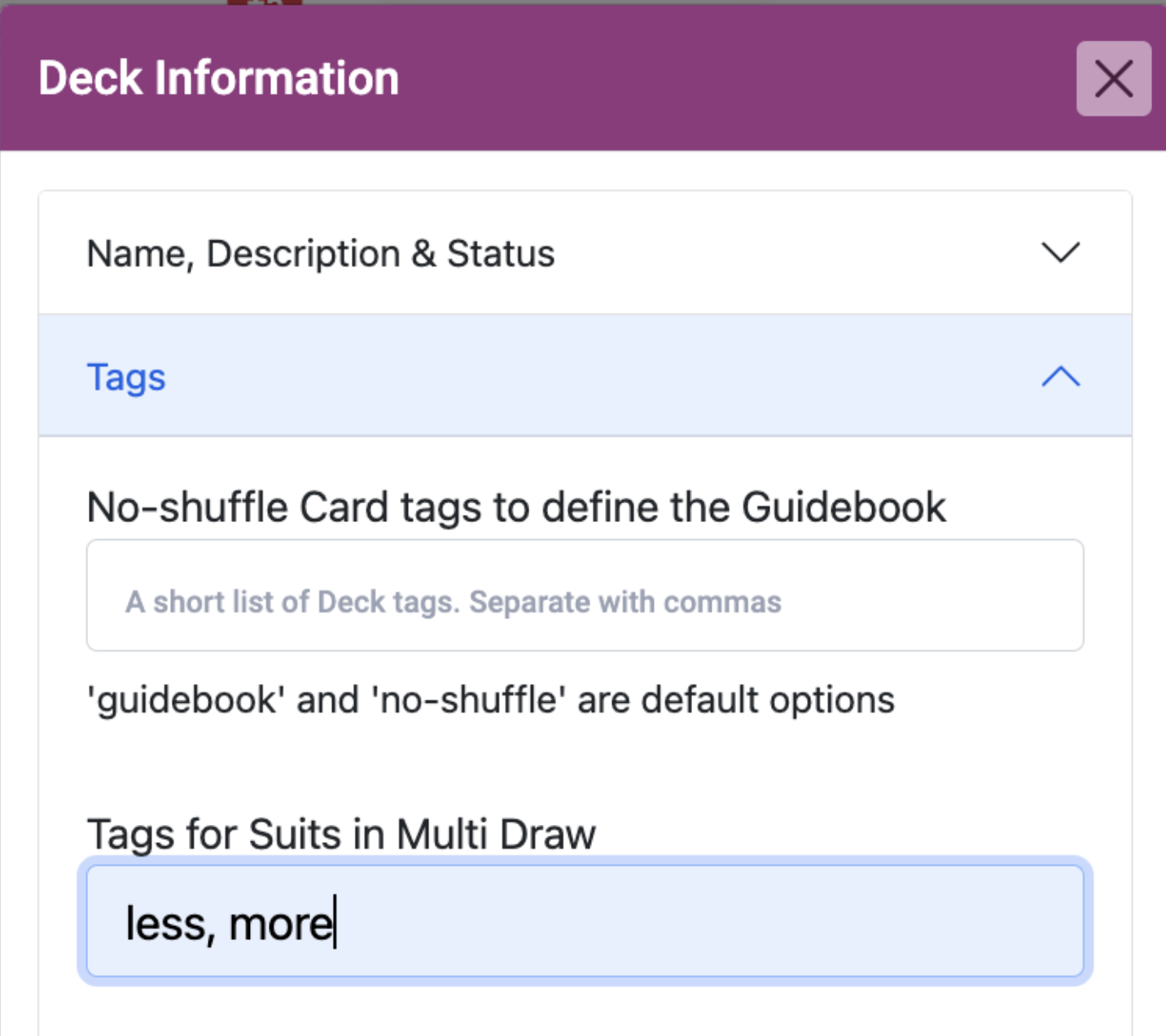
If your deck has "suits" that are defined using tags, you can now define just the tags that define your suit cards.
Simply edit your deck and paste/type a list of the suits for Multi-Draw.
You need to do this as there will likely be some tags that are not applicable.
And then randomly, the app will select one or more card from each suit.
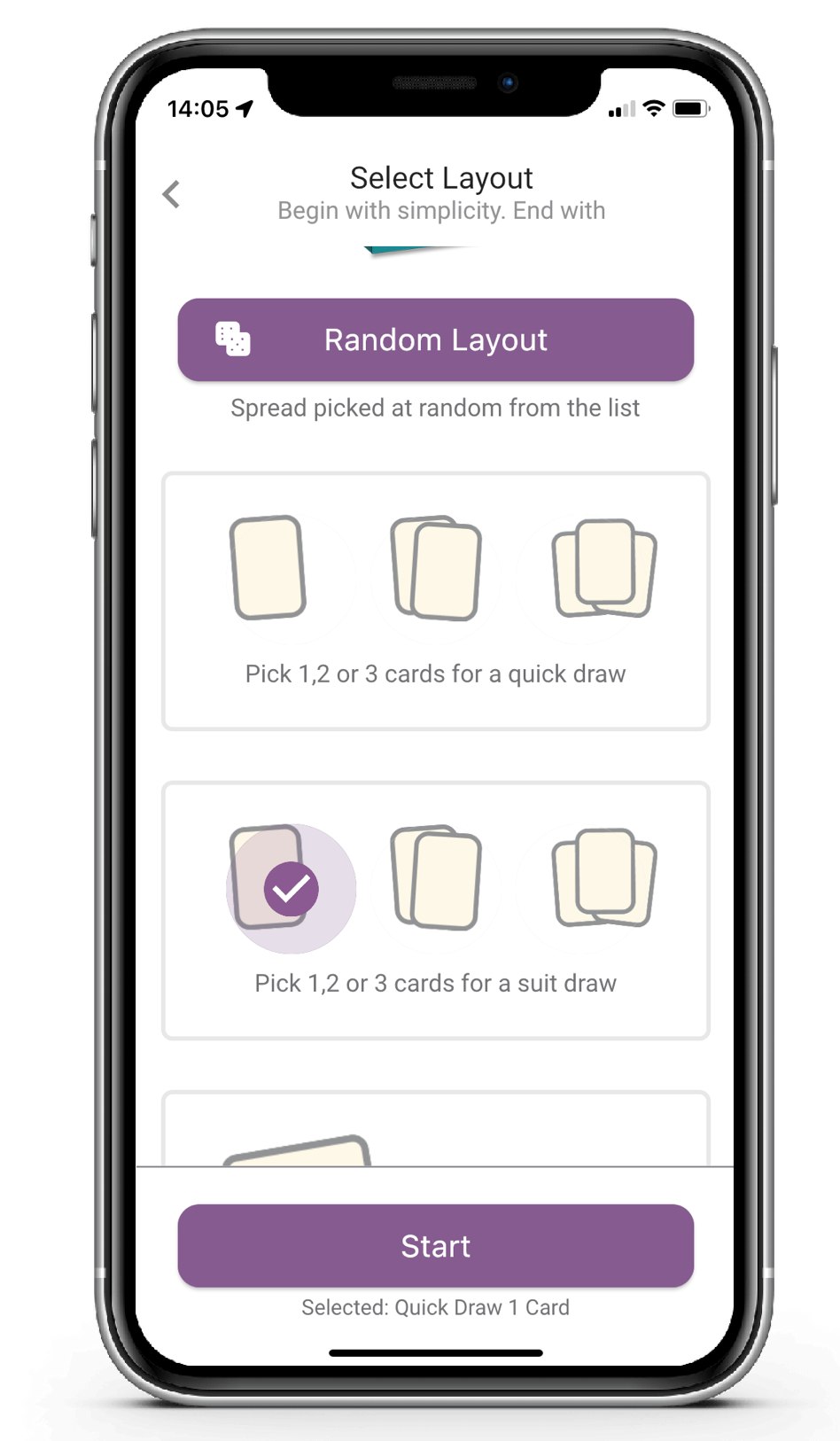
40 creators you have asked for this. It does require a little bit of setup in advance (see above). When this is done, you will see an additional option when selecting your layout. Here's 5 examples.
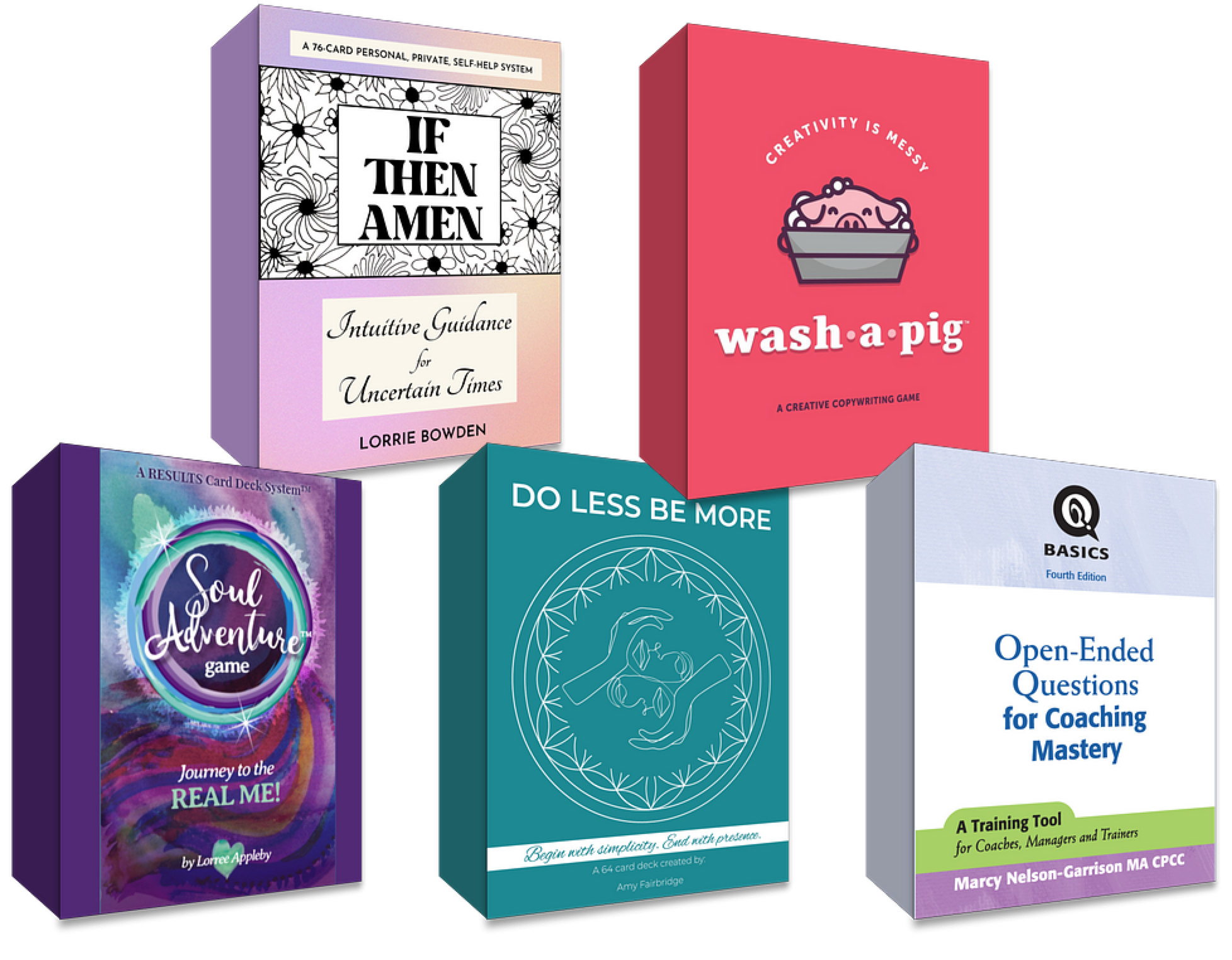
For the above deck I've already completed the tags.
Here, I chose 1 card per suit.
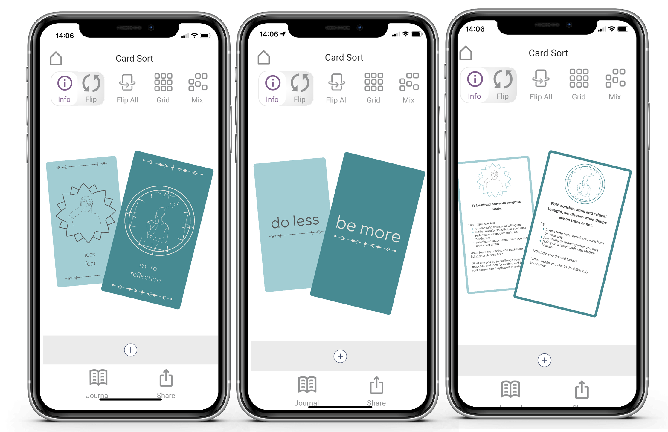
In this deck there are 32 do less cards and 32 be more cards
And I got these two cards. One "less" and one "more" card.
I flip through the three sides and can pinch and zoom as expected.
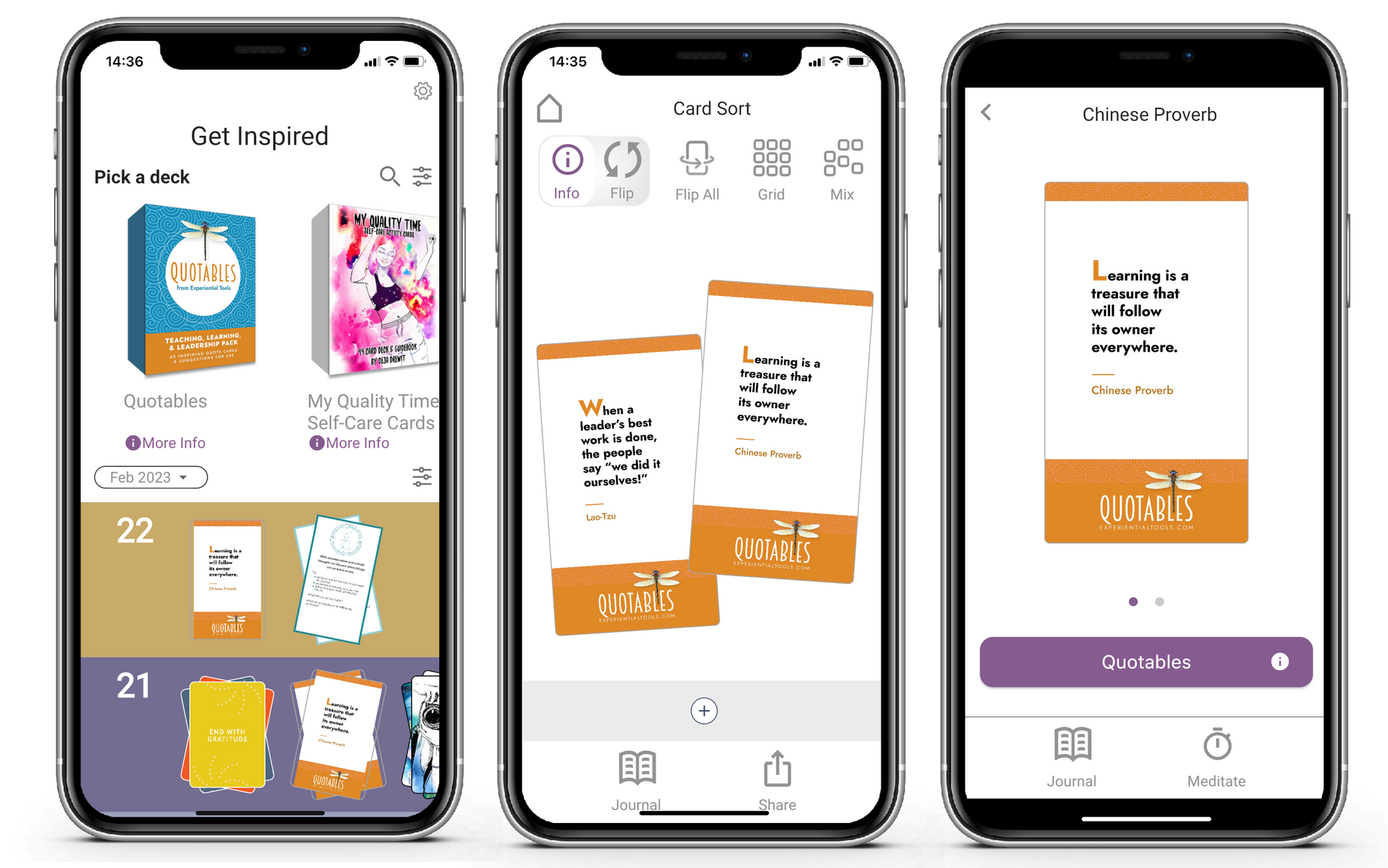
Journal on a single Card
You can now journal on a single card. Just click on the card in your reading and click "Journal". It will create a new single timeline event for that card along with your journal.
So I choose a deck or a reading.
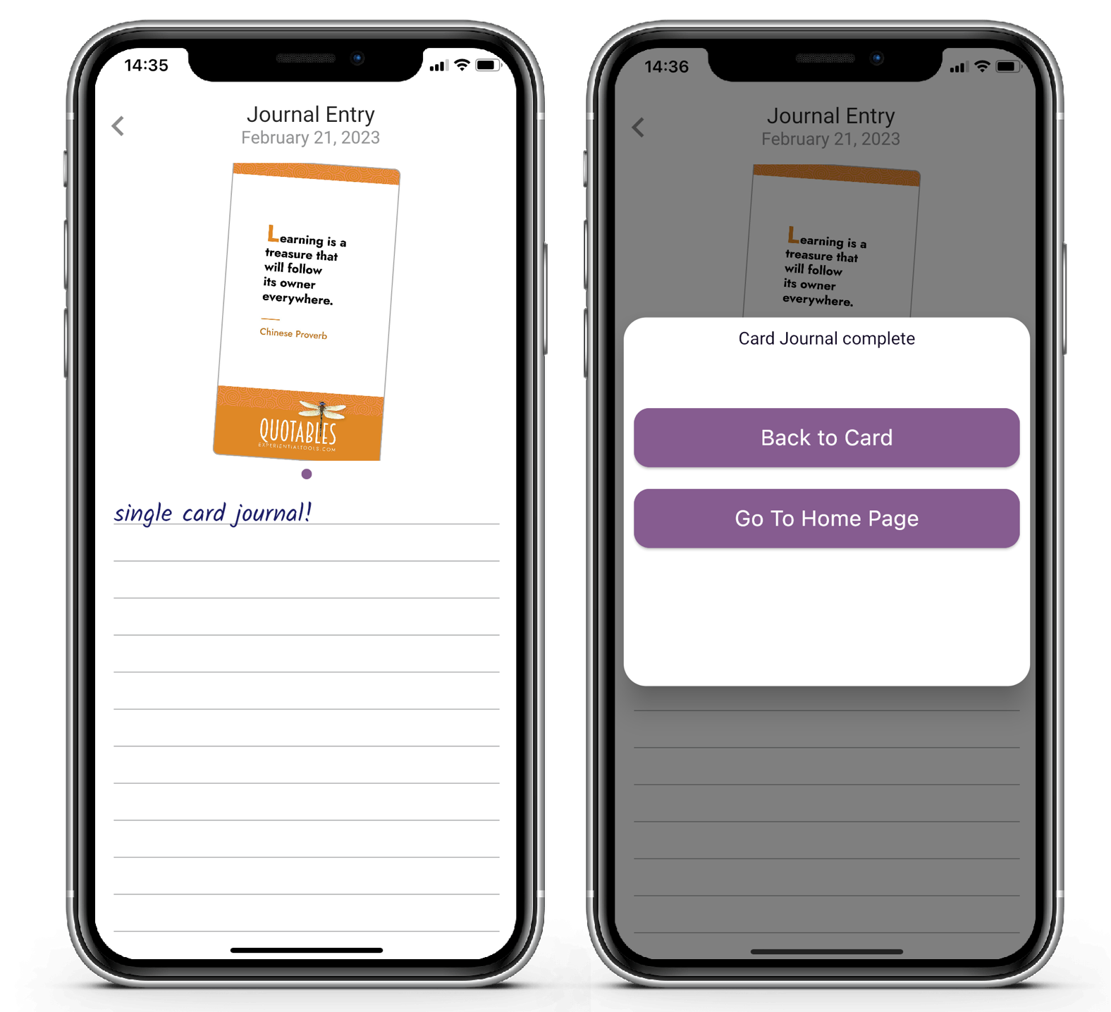
Click on a single card. Then select journal.
Now I can jounral on the card. And it save the card to the timeline as a unique reading along with my jounral entry.
Quick Draw on Tarot Spreads
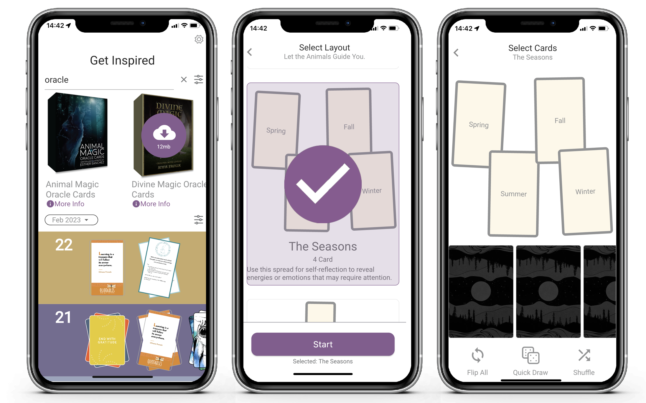
We added an option to pick random cards to complete your spread.
Click the Quick Draw button, once per card. And your spread will be completed.
Once complete, you can click reveal as normal.
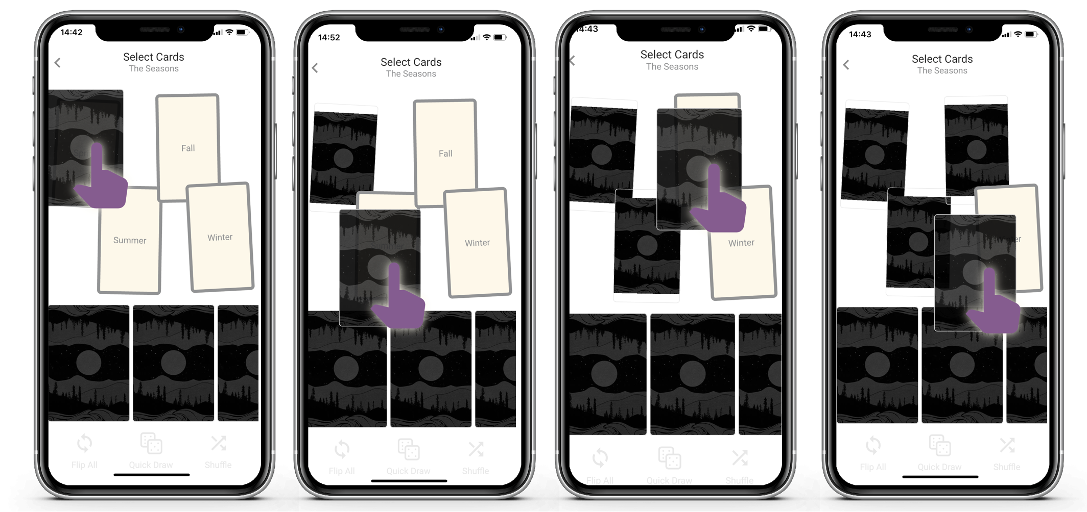
Click quick draw to have the app animates and places a random card into your spread. When your spread is complete the option to reveal that cards replaces the quick draw option.
This is fun to video using screen recording.
You can of course still drag the cards one by one to each location in the spread.
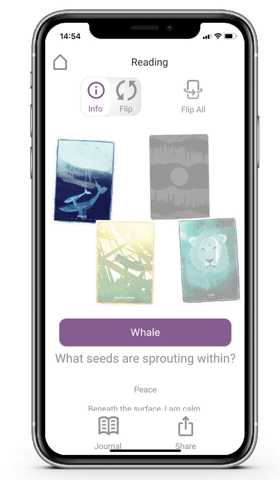
And finally click reveal and explore your spread by clicking on each card in turn to reveal the meaning of the location and the card.
Private Sharing
We have re-written the visual portion portion of sharing to be more intuitive.
So when you pick share, you need to give the app permission to dynamically read your contact address book (this is a one-off request).
We don't store your contacts or have access to them other than when you choose to share. You can search for a contact by name.
Pick share, grant access and then moving forward you will just see the contact list (the middle two options below are first time only).
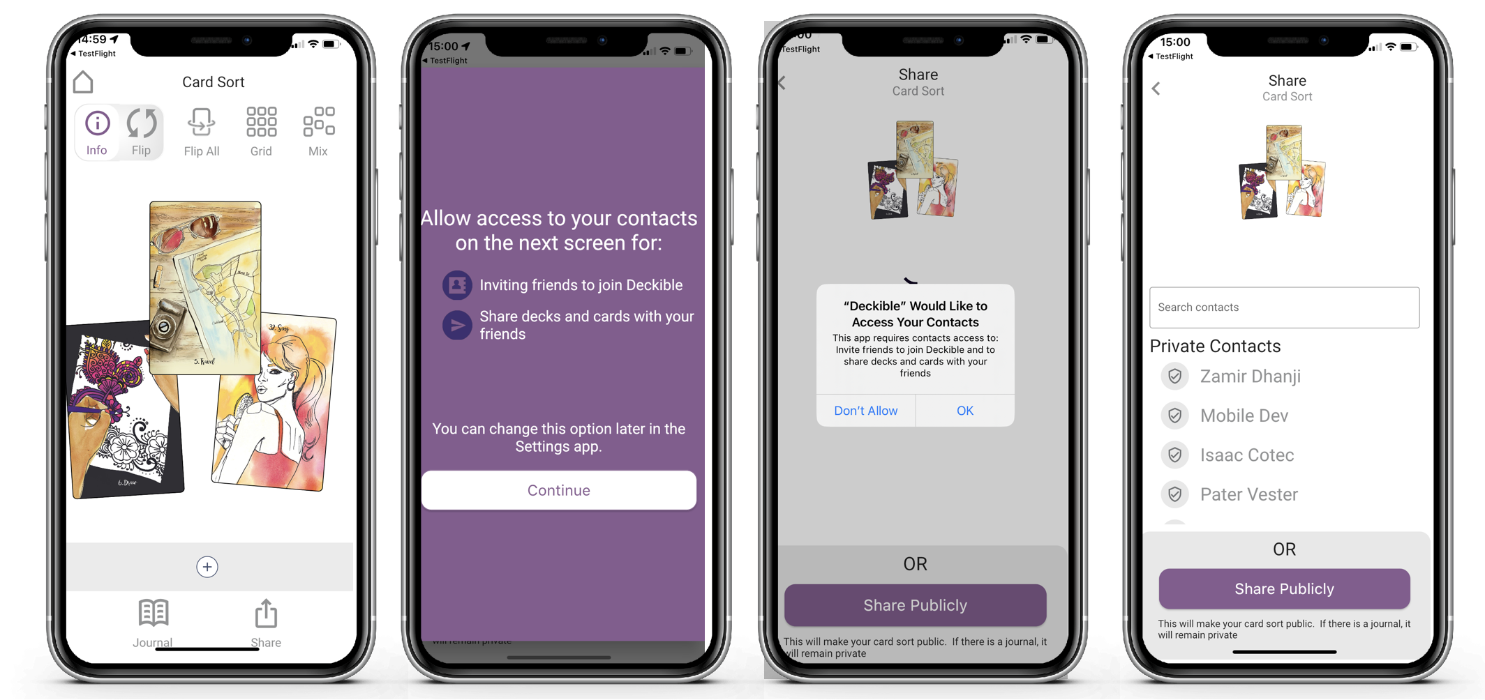
You can select a contact and click send. You can also search for a contact. We removed the option to add a contact as you simply add the person to your contact address book and then that person will be findable in Deckible.
It's much more intuitive than the prior version as you now click "Send" to complete the share.
It is also more reliable (this did not work consistently to load the contact list in the prior release).
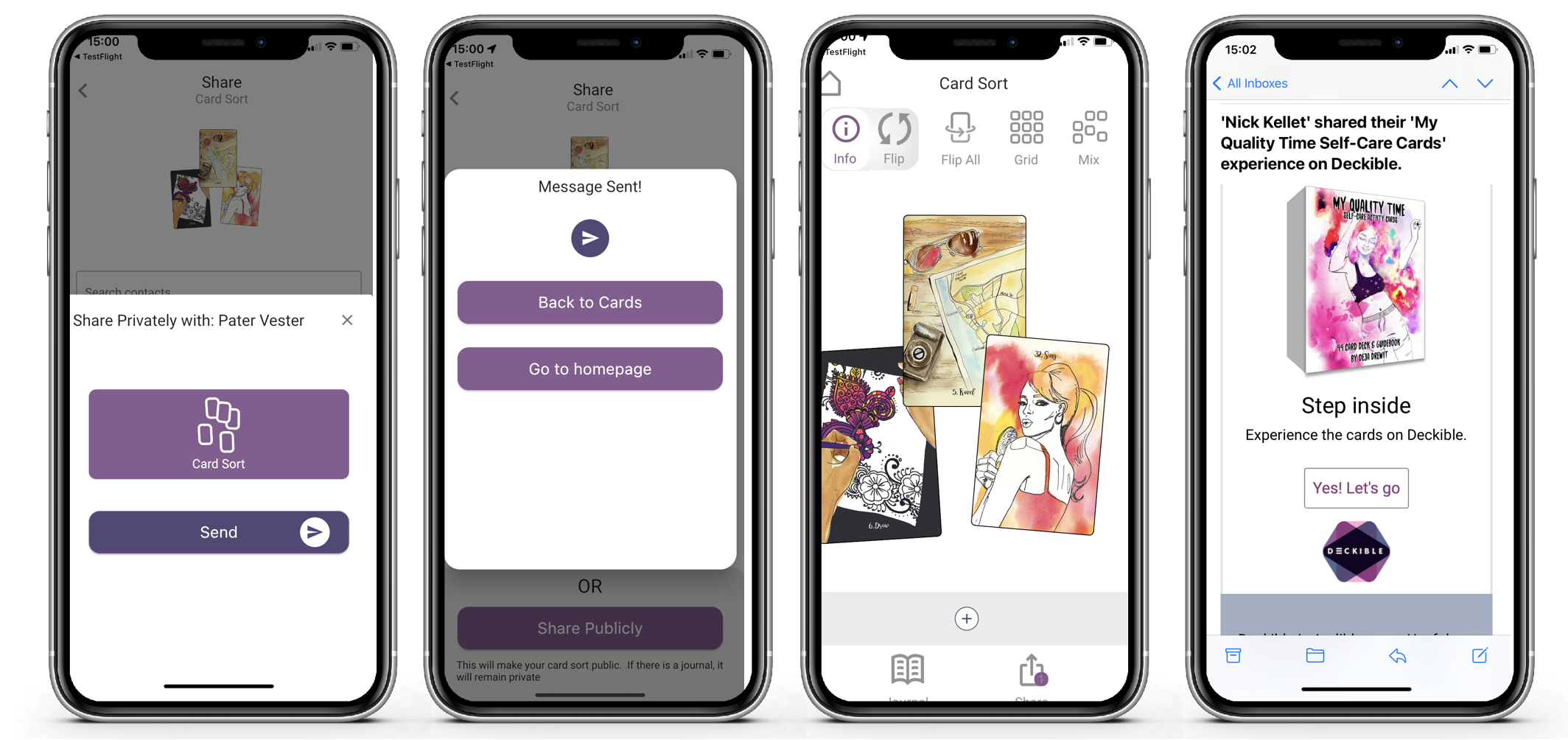
The final screen above show you you the the email that is received by your friend.
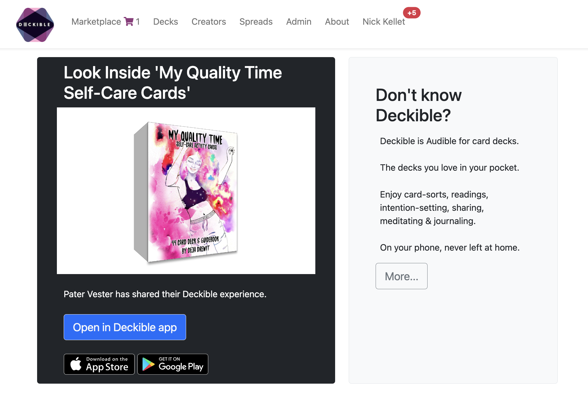
In the email they click on 'Let's go' and the will see this screen below. Clicking open in Deckible App will open this timeline event in their app. They need to have the app installed and be logged in for this to work.
It's slick.
In this example notice that the card is glowing, because I've not opened my gift yet. When I open it, I can interact with the cards.
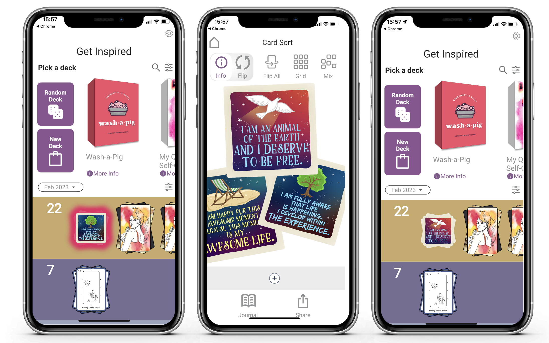
When I close the reading, the glow has disappeared.
Your timeline acts like an inbox.
Share Publicly
This is new. We simply create a screenshot of your reading and share it via the extensive options that IOS/Android offer.
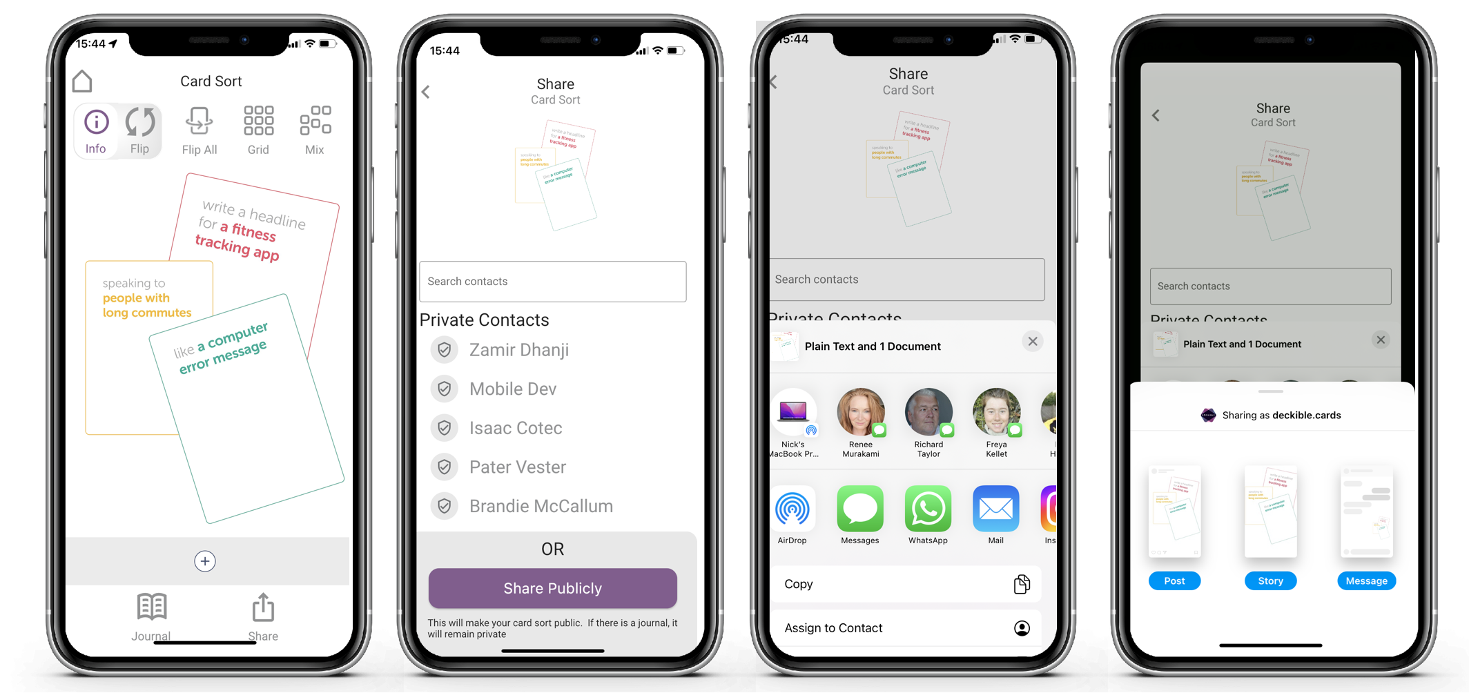
It's very powerful, especially on IOS. So many options, but ones you know. And it adjusts to the apps you have installed.
On IOS you can share to Instagram or SMS or email and so on. It's incredibly simply and incredibly powerful.
Make sure you arrange the cards as you wish before you share them.
If you are sharing socially don't forget to add #deckible to your text.
Share Privately vs Share Publicly
Private sharing gives people a copy of your reading, so they can see and touch the cards in the deckible app. They can't create a new reading, but they can touch/flip and arrange the cards. It makes it easy for them to buy the deck if they want their own copy.
It appears as a reading in their timeline (a gift from the sender). It glows until it is read. They can touch and flip, move and inspect the cards. it's the full experience.
Private sharing requires an email address and the recipient in invited to join deckible and view the cards. We don't offer SMS invites at this point.
When they click on the link for the first time, they need to set their password.
By way of contrast, public sharing does not require access to the app. It simply shares a collage image of your reading.
Timeline Filtering
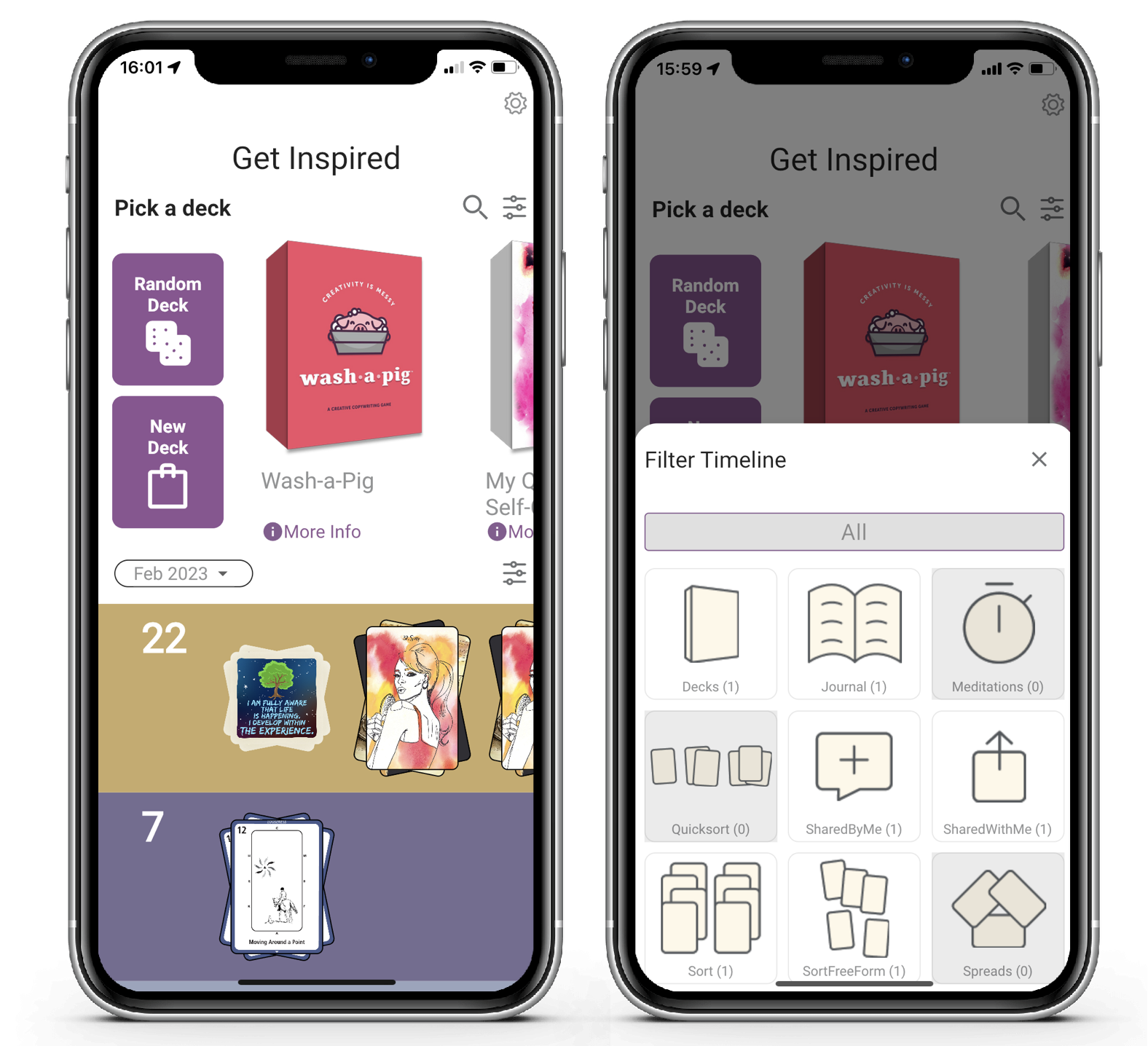
You have a lot of options to filter the events in your timeline.
You choose to see cards You've sent and card that have been shared with you.
It' also shows if any of those filterable events exist in your timeline.
Simply click on the filter icon to the right of the month selector to setup a filter.
And click "All" to remove the filter.
Default Pricing
I've mentioned this before, but the default price for a published deck is now $ 9.99 USD.
A number of decks were not priced and so setting the price to $9.99 makes is simpler and it makes all published decks be purchasable.
You can always update your price.
Guidebook
Cards and the Guidebook Cards are implemented in very similar fashion, but with time and reflection, differences are emerging.
Guidebook cards no longer show the shared back of a card. There was no purpose to seeing this face, but it will show the shared back if there is no card artso that you can access the text/audio/video
When you click on guidebook the cards are laid out in a grid depending on how many cards there are
Here's an example, with one double-sided card
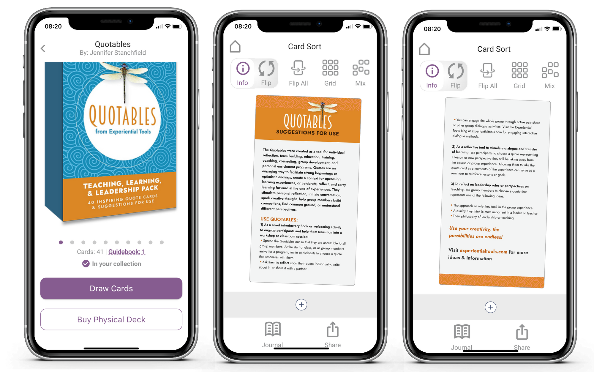
Here's an example, with tend double-sided cards
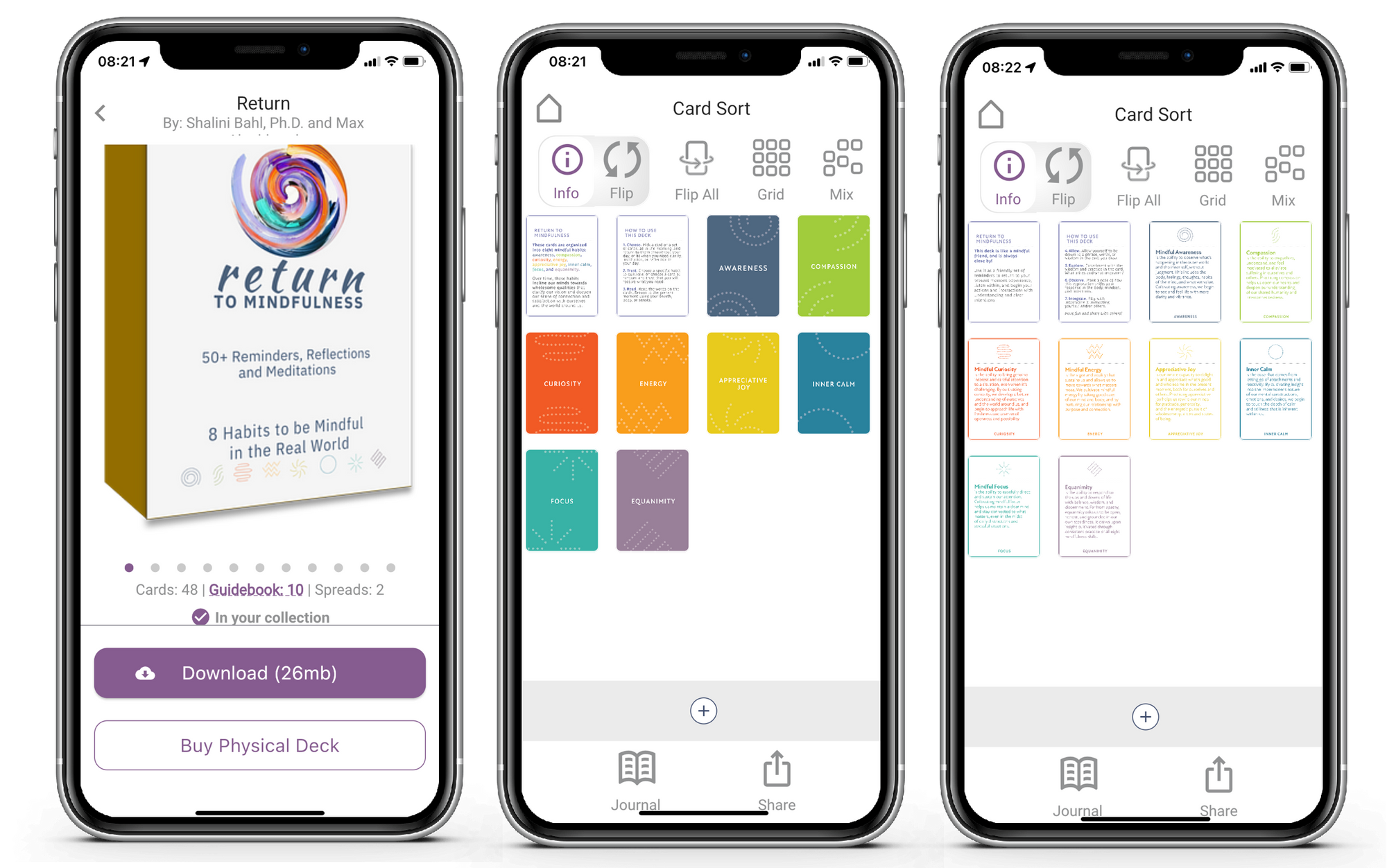
You can pinch and zoom each card. Or just click info to go to full screen and flip through the sides.
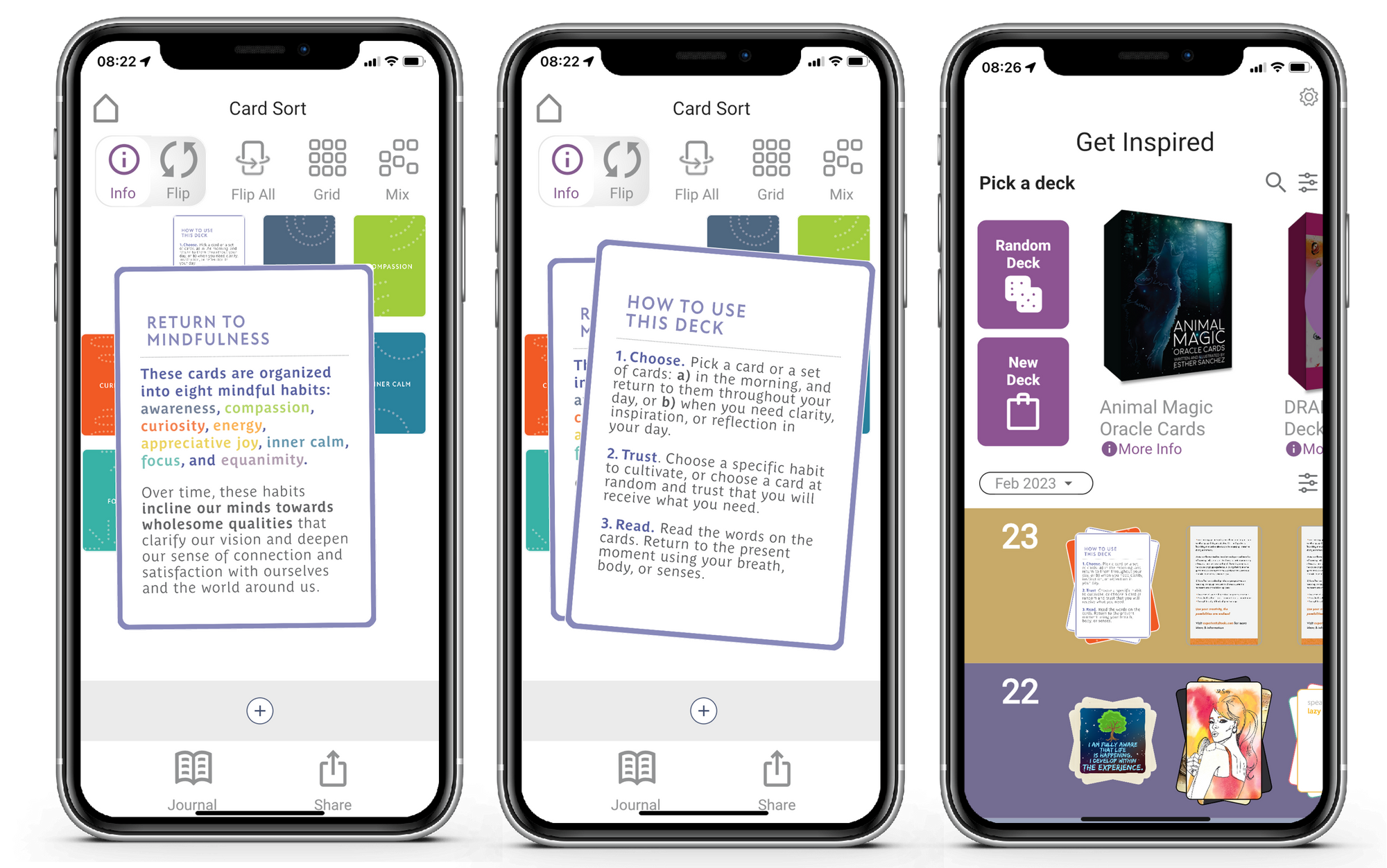
Notice that the guidebook is saved as an entry in your timeline.
Multi-Deck Readings
This is now new, but it's worth a recap.
Here I choose to pick a card from one deck.
Then I click on the deck icon to pick another Deck.
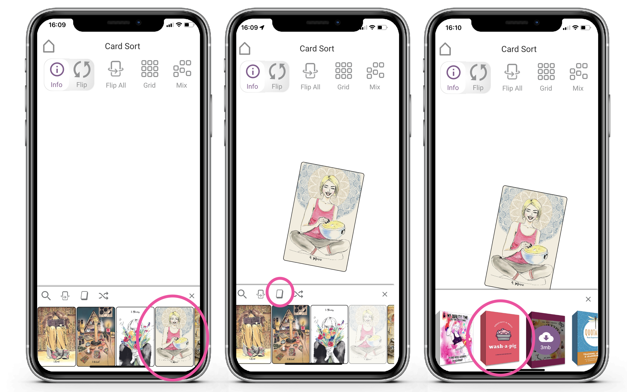
I can then repeat this process and select cards from difference deck.
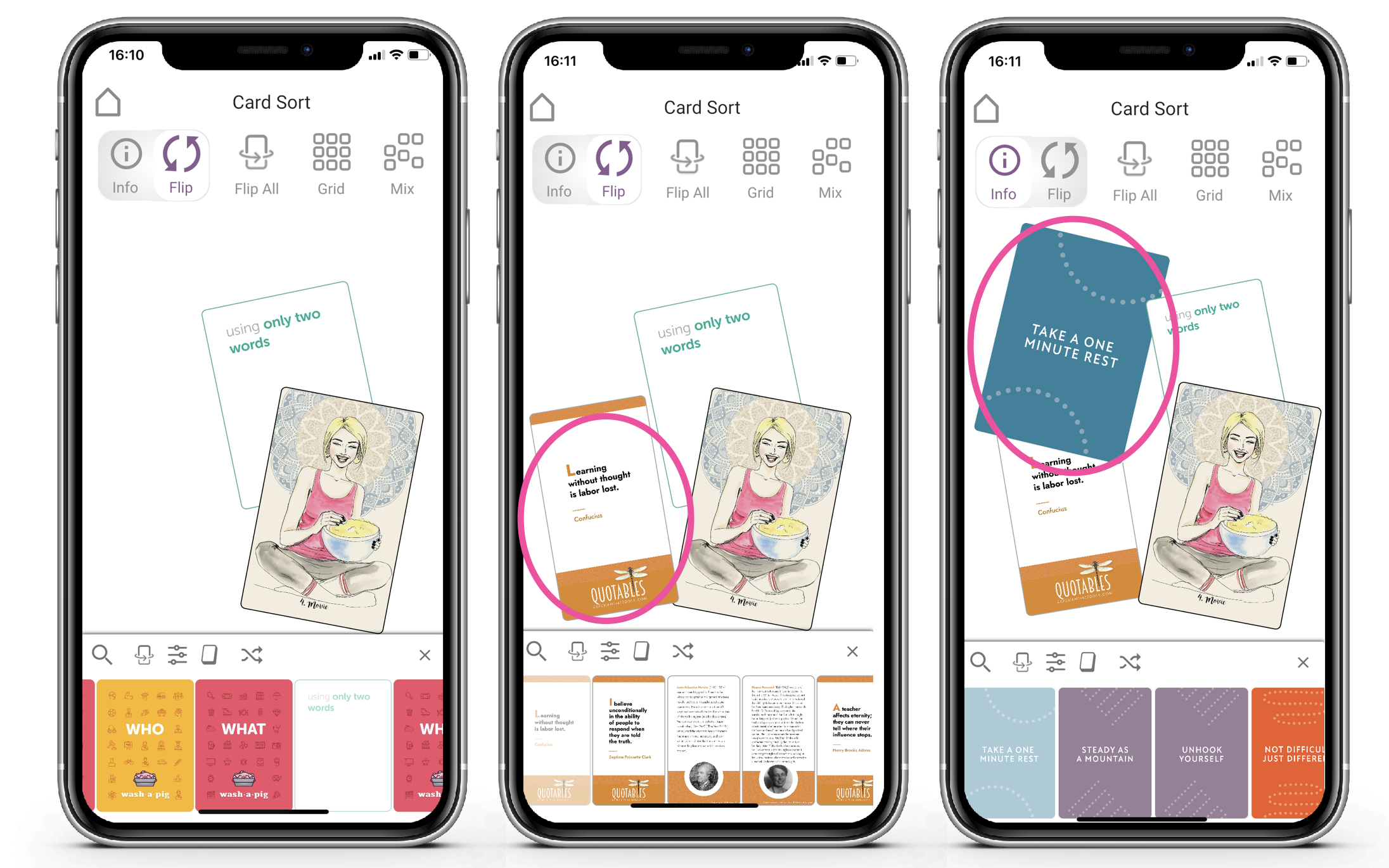
In this examples I picked cards from 4 decks. Easy.
Deleting Card from a Reading
I can also delete cards. Simply click and move the card.
Notice the + turn to a trash can and that the color is pale red.
As I drag it fully over the trash can I can see it goes fully red.
Simply release the card at this point and it's deleted from your reading
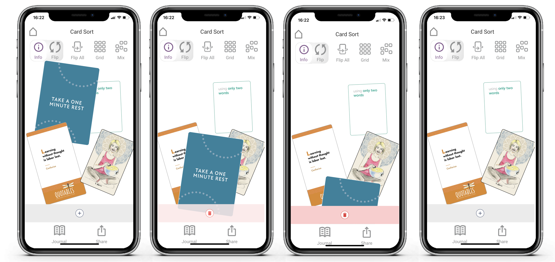
This is simple and intuitive. Just explore.
New Team / New Energy / Same Vision
I've had a few months to reflect on our strategy for Deckible. And I've taken time to rest, re-group and reflect.
I'm excited to announce that were joining forces with the development team (Paul Vallender and Jason Lilley) that built the app. Also Mark Hudson is joining the team. Mark has been an active advisor.
Mark and I met as we'd both sold prior tech companies to Business Objects. Paul and Jason were core to the development team Mark's prior startups.
We now have more resources and a more balanced team to execute on the vision.
Setting out our stall as "Audible for card decks" a clear choice. This led to the following key design decisions.
- Multiple Decks in one app
- A Visual Timeline of events.
- Offer a tactile card-deck experience.
- Multi Sided per card ( including audio/video)
- Cards & Guidebook using a shared approach
- A dual focus on on Tarot Spreads and Coaching Cards / Card Sorting.
- Integrate journaling and meditation
- Self-Serve uploading of creator Decks.
Deckible offers a modern approach to offering multiple decks in one app. This is unique and a key differentiator.
Deckible isn't just the app, it's also a community, and hundreds of creator. You all have unique passions and energies.
With 400+ deck, Deckible is by far, the biggest multi-deck app.
Deckible is the only app designed from the ground up to be multi-deck and to handle a complete range of cards deck experiences in a single app.
This is no small feat and a wonderful foundation to build upon and I'm excited for the journey ahead.
I thank you for your patience and support.