Digital Card Decks Get Playful Update: The ultimate short-form media.
Big Playful Update: More to Push, Prod & Poke
We detail lots of new features below. This is a big release.
The Deckible experience is unique. We didn't just digitize a deck, we asked "What would a deck want to be if it was digital?"
Digital Decks have evolved to become a hybrid of multiple kinds of media. A container for modern life. The word is edutainment. We use decks for so many reasons spanning fun to education.
It's all about creative combinations & engaging participation. Combine cards, combine decks, combine media. Humans love to combine ideas, thoughts, words etc.
Deckible is defining/ creating the digital card deck experience and the digital card deck marketplace category. That means learning what people expect and need, while also redefining and expanding expectations as we go.
You, the consumer needs to explore and push and prod and poke to see what's possible and imagine what you want/need.
The world is divided into two camps.
- Those that explore and push and prod and poke: self-learners
- Those who seek guidance and ask for help: guided learners
We offer onboarding help in Deckible, see below, but the best thing to is to try things, move things, stretch things, stack things. You can do no harm.
This release includes some major additions and improved consistency. A process that will continue and it's guided by your collective voices & feedback. Please speak up with your frustration if you have them. Also share your joy. Send your thoughts to support@deckible.com
1. Introducing Deck Browsing
We'd omitted a basic feature - browsing a deck. You could browse the cards, but the artwork was tiny and the main purpose of this feature of Deckible was to select cards.
This addition makes Deckible simpler for a new user to get value from their decks.
So now we offer both "Select Cards" and "Browse Deck". Both screens work together.
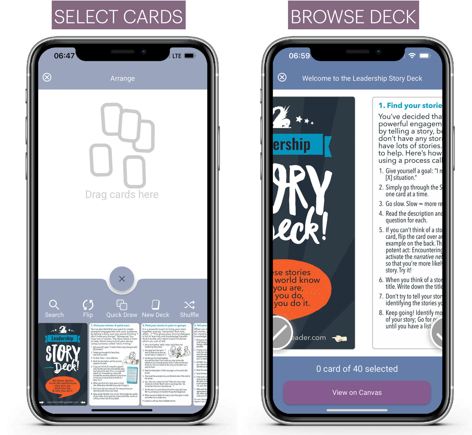
Browse Deck also acts as a card selector and you can then move those cards to the canvas. It's taken top billing on the layout selector. For many, it is a simpler way to experience the product.
It's easy to miss simple features when you are focussed on achieving the challenging stuff like mixed deck reading and the unique tactile deck experience.
We're very open to feedback, so please share your experience to support@deckible.com
How to browse? Simply select your deck, then select browse.
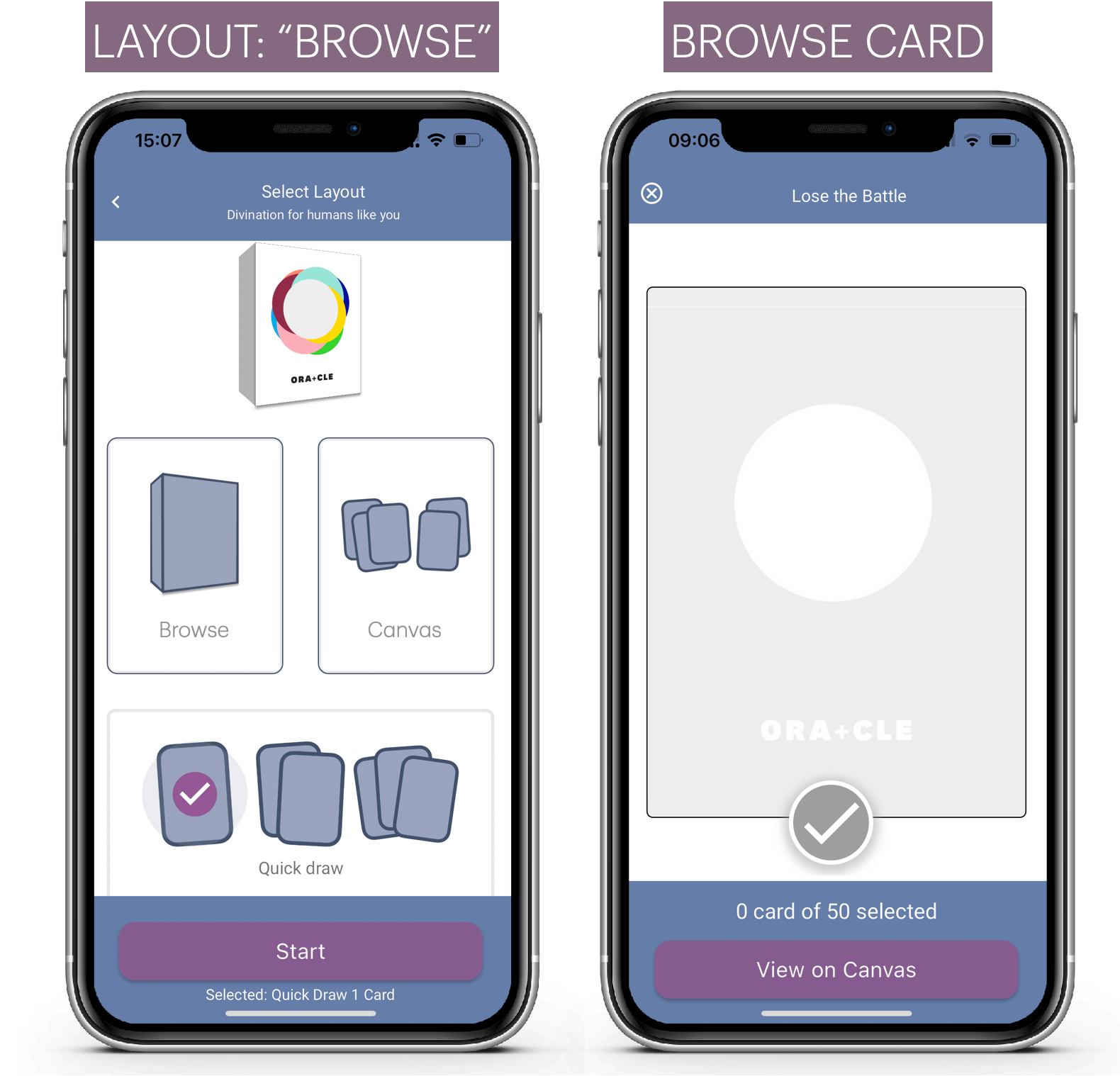
Now you can look at all the cards, and slide from card to card.
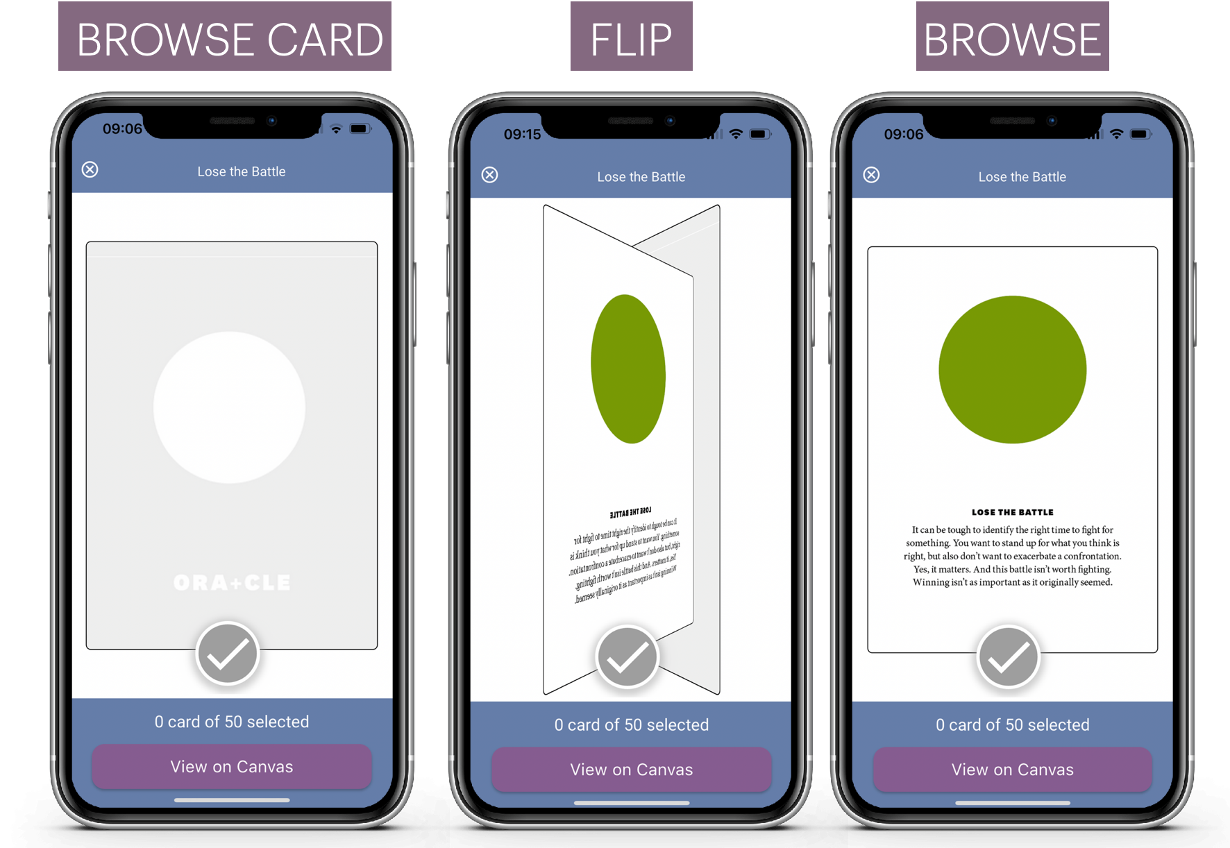
And you can tap the card to flip and select or swipe to the next card.
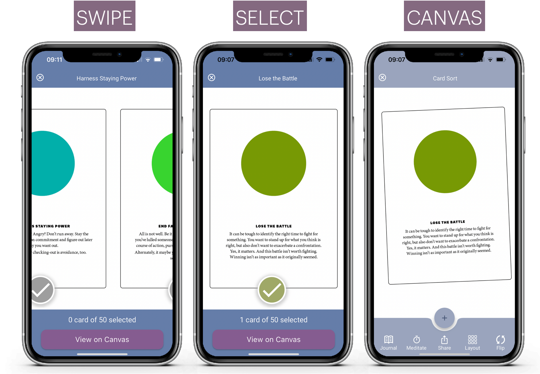
Cancel at any time, or choose to move the selected cards to the canvas. Then you are back in familiar territory being able to select, arrange card s and journal etc
Let us know what you think.
2. Zooming on Pre-Defined Layouts
You can select your layout and choose cards as before
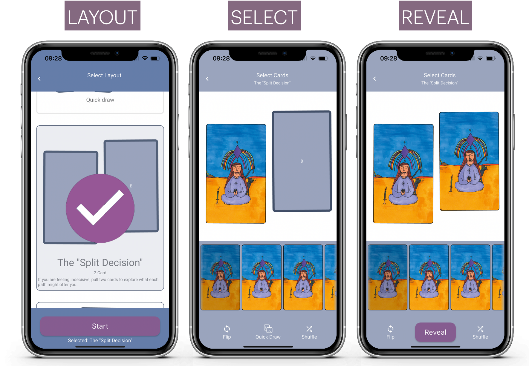
Now you can zoom to access card mode for each card in the spread
Simply tap on the card in the spread and click zoom.
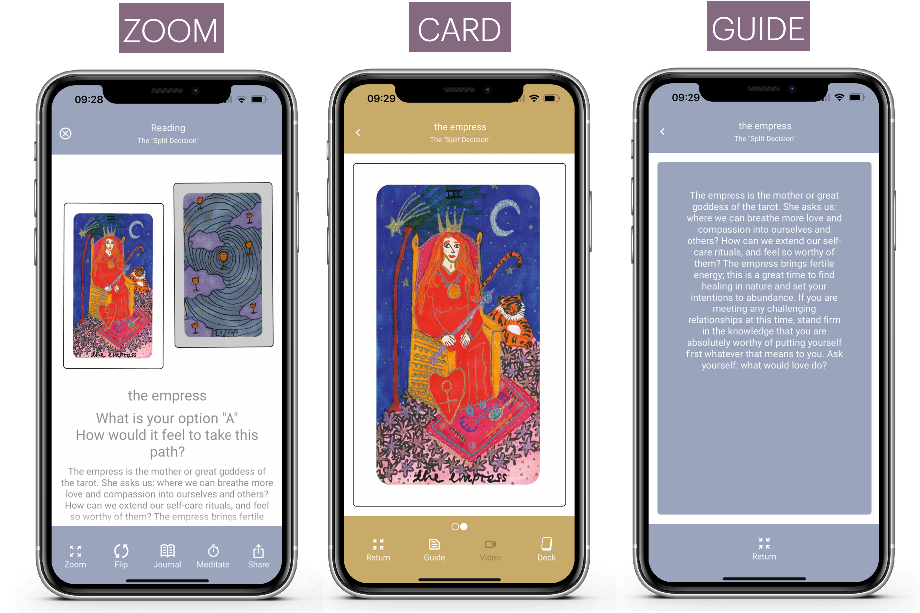
This gives you access to all the card art, face by face, the guidebook text (the card description) and the ability to play audio and video.
In the prior release we introduced Canvas Mode and Card Mode. And that was a big hit. We did, however , omit the ability to zoom to a card in a spread. Now you can get zoom, read the text on the card, listen to the audio or watch the video. It's simple and consistent.
3. Saving to Timeline / Discard Draws
- Some were unsure how/when their draw was saved.
- Others asked for the option to not save their draw.
The draw only saves when you exit the canvas or the layout.
If you close the app the latest draw will be lost if you have not returned to the home page.
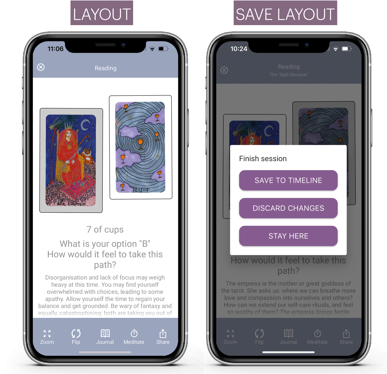
Now you get a save or discard when you hit "X" to close the canas or layout screens. "X" is also new. It used the be a home or a back button.
The "X" clearly communicates ending/saving your draw.
This applies to Canvas and Layout draws as follows.
"X" Canvas Draw
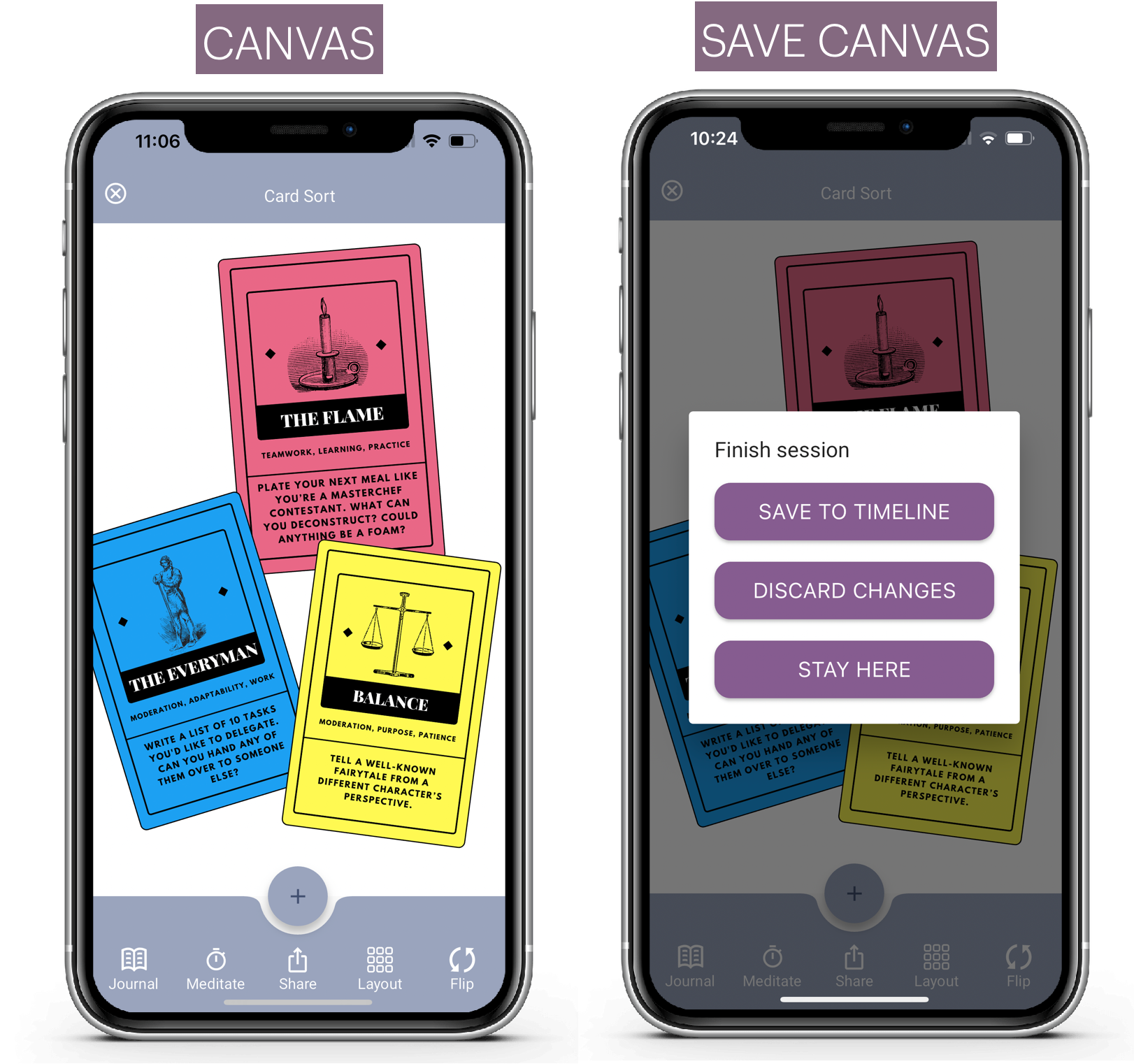
"X" Layout Draw
4. Archive Timeline entries
People also asked to delete draws. A totally logical request. It's been on the list for a while and it finally made it into the product.
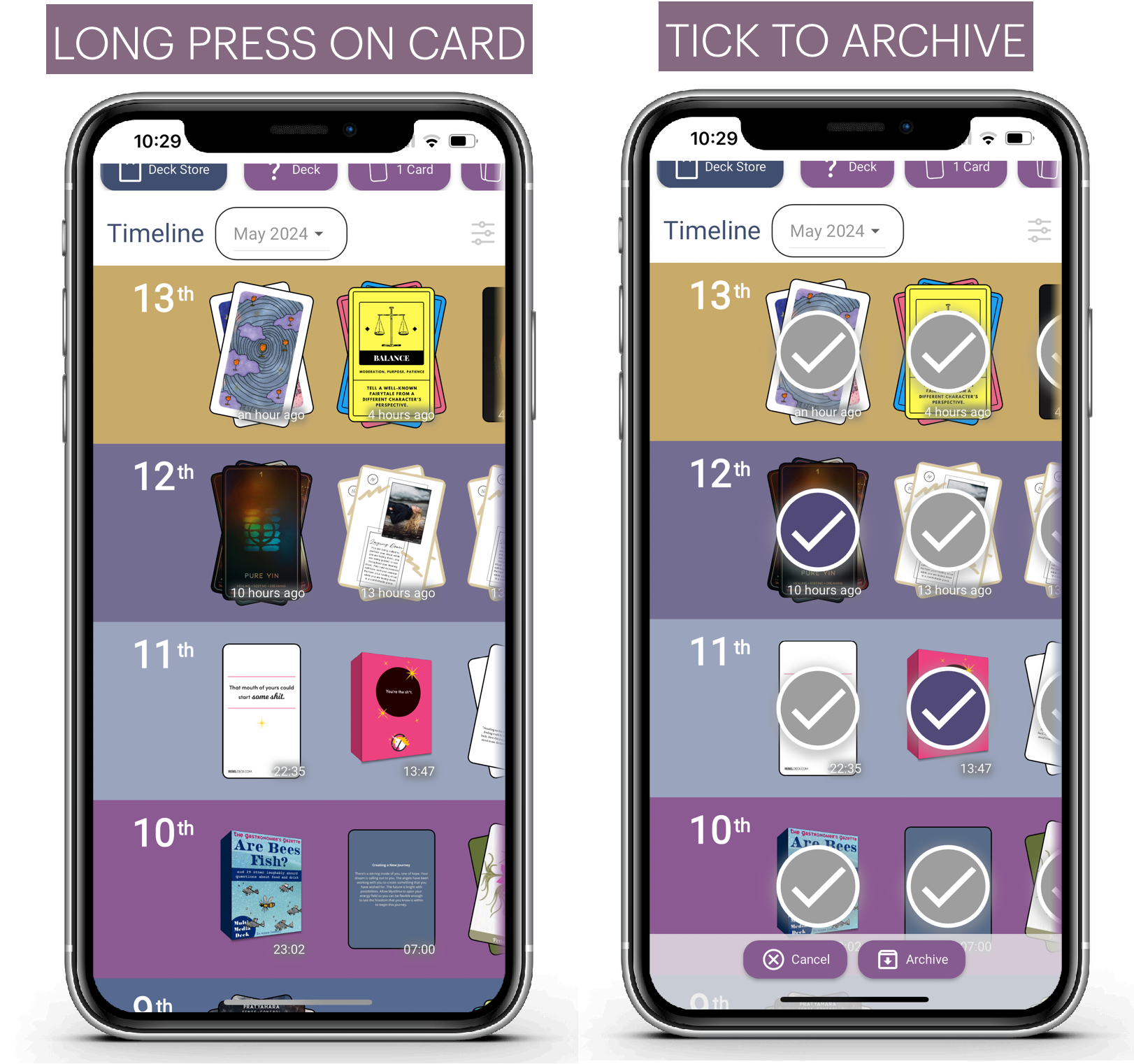
Simply "long press" on any card in the timeline to go to "Archive" mode. Then choose which draws to archive. Click Archive to complete the archiving of the selected draws.
5. Redraw on Quick Draw cards.
People have asked about re-drawing cards when they quick draw. If you draw cards you don't like, you can now redraw.
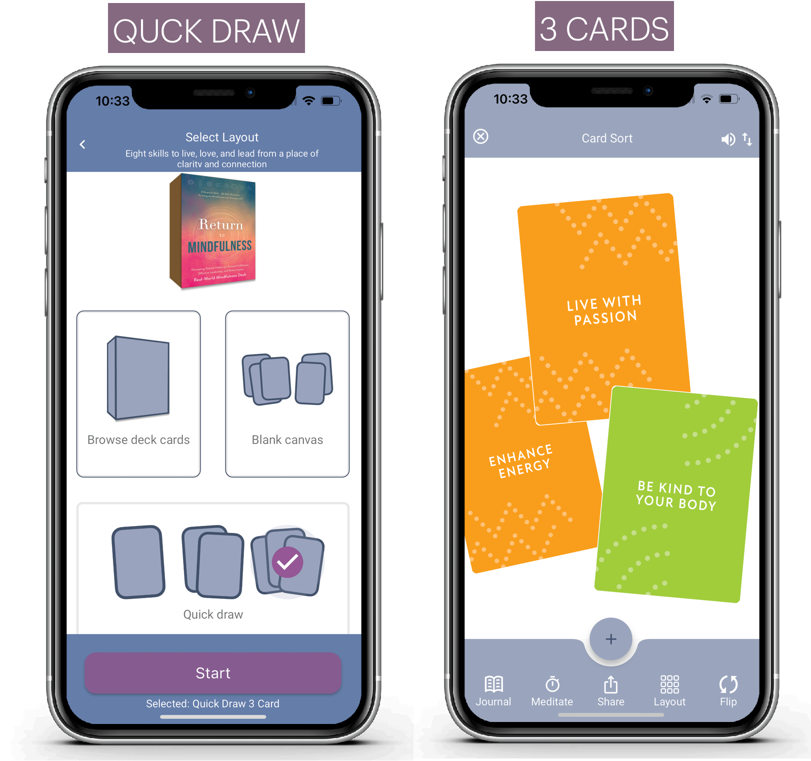
This is quicker than not saving, or saving and deleting.
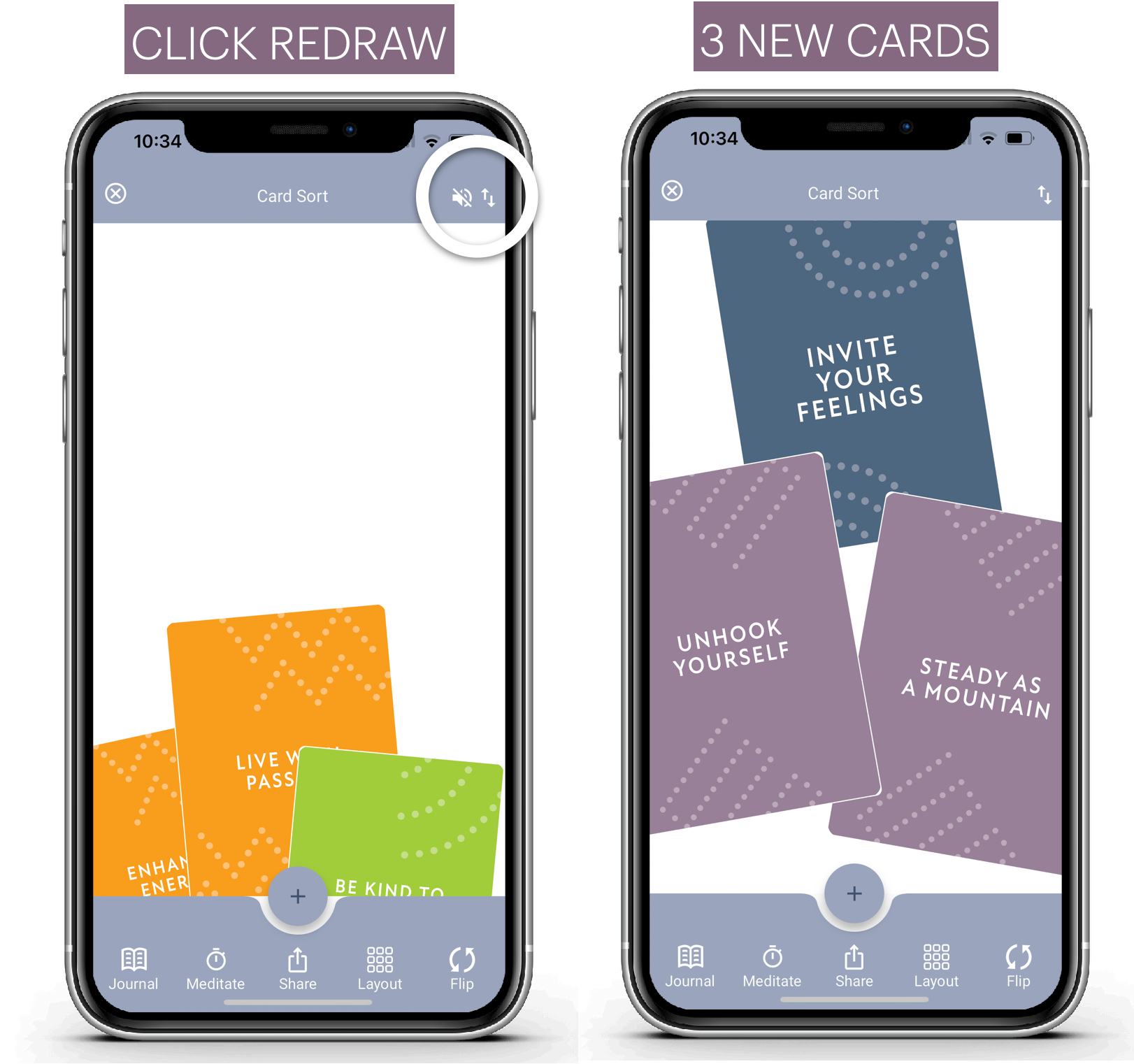
The up/down arrow triggers a redraw and cards fly off the bottom and new cards fly in.cRedraw is only visible when you first do a quick draw, it's not an option on editing.
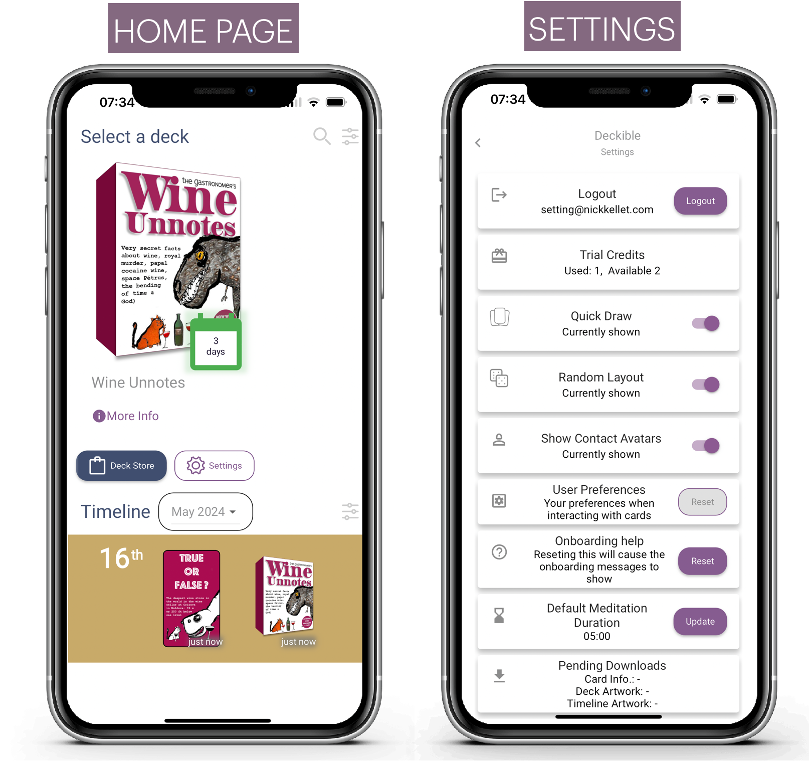
6. Accessing Settings
Access settings from the home page, below your decks. This is now much more visible. If you can't see settings, you can scroll right
From settings you can turn things on and off, so you can control behaviour of the app. Not everyone wants everything to be the same. So we let you customize the app experience.
7. Onboarding Updates
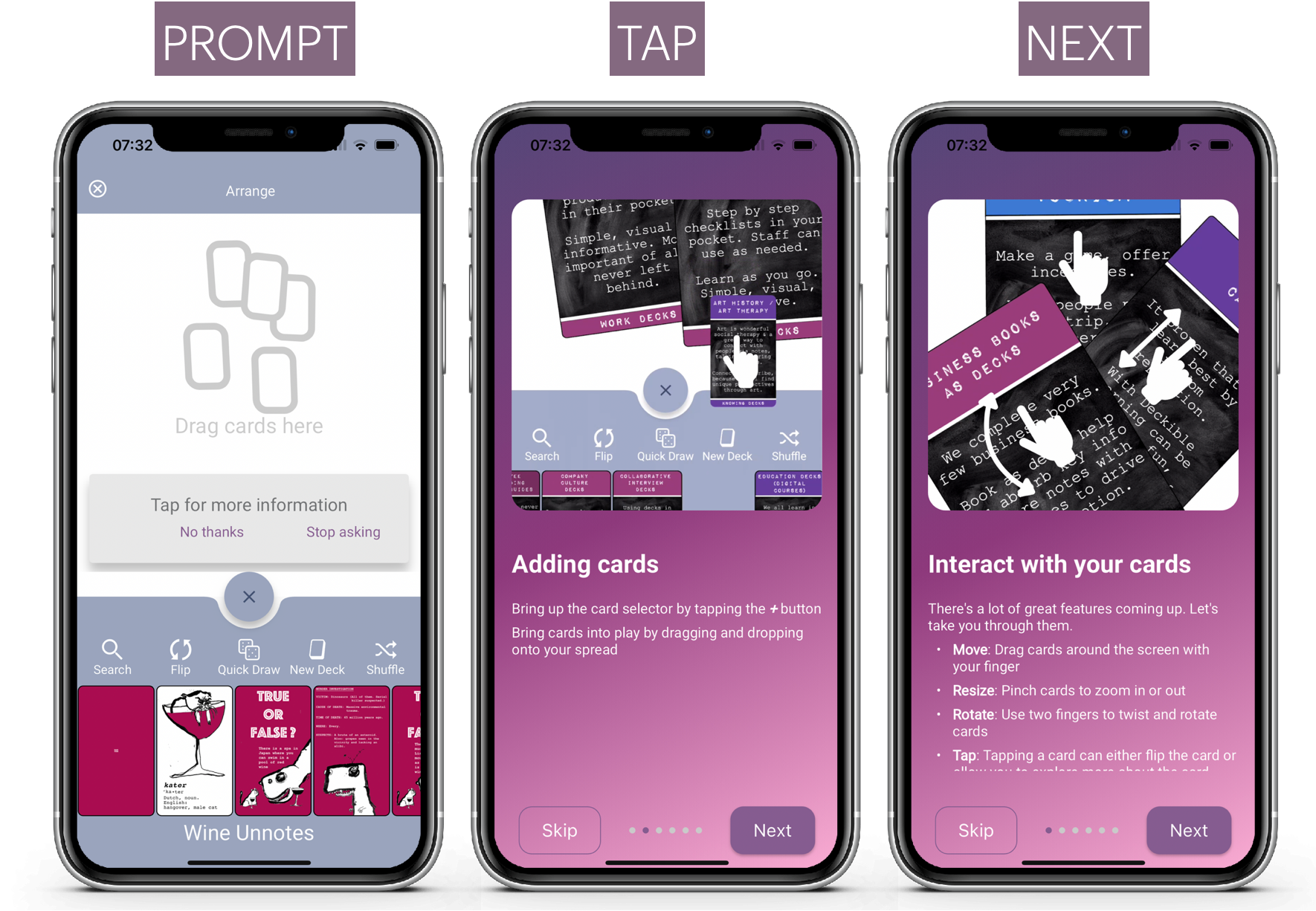
We've updated the onboarding screens. Perhaps you didn't notice them, perhaps you dismissed them.
Well you can reset to have them reappear from settings. See above.
When you click on an aspect of the app for the first time, you get an onboarding prompt. If you accept the prompt, the onboarding screens step you through the available options.
You can find most of this just by playing, but if you need it, the on-boarding is available anytime you want.
8. Quick Draw and Random Deck Configurations
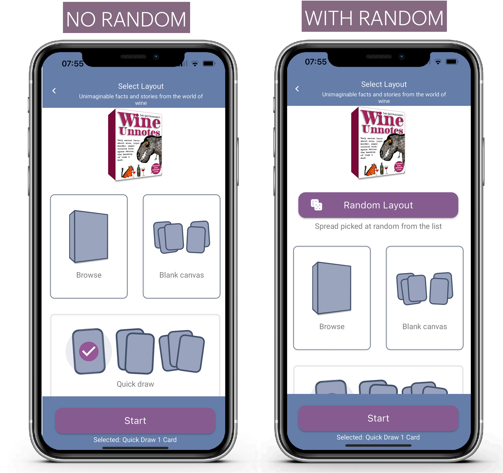
You can turn off quick draw from the home page in settings.
You can turn off random layout on the layout screen from settings
With quick draw on the home page it picks a random deck and draws 1, 2 or 3 cards.
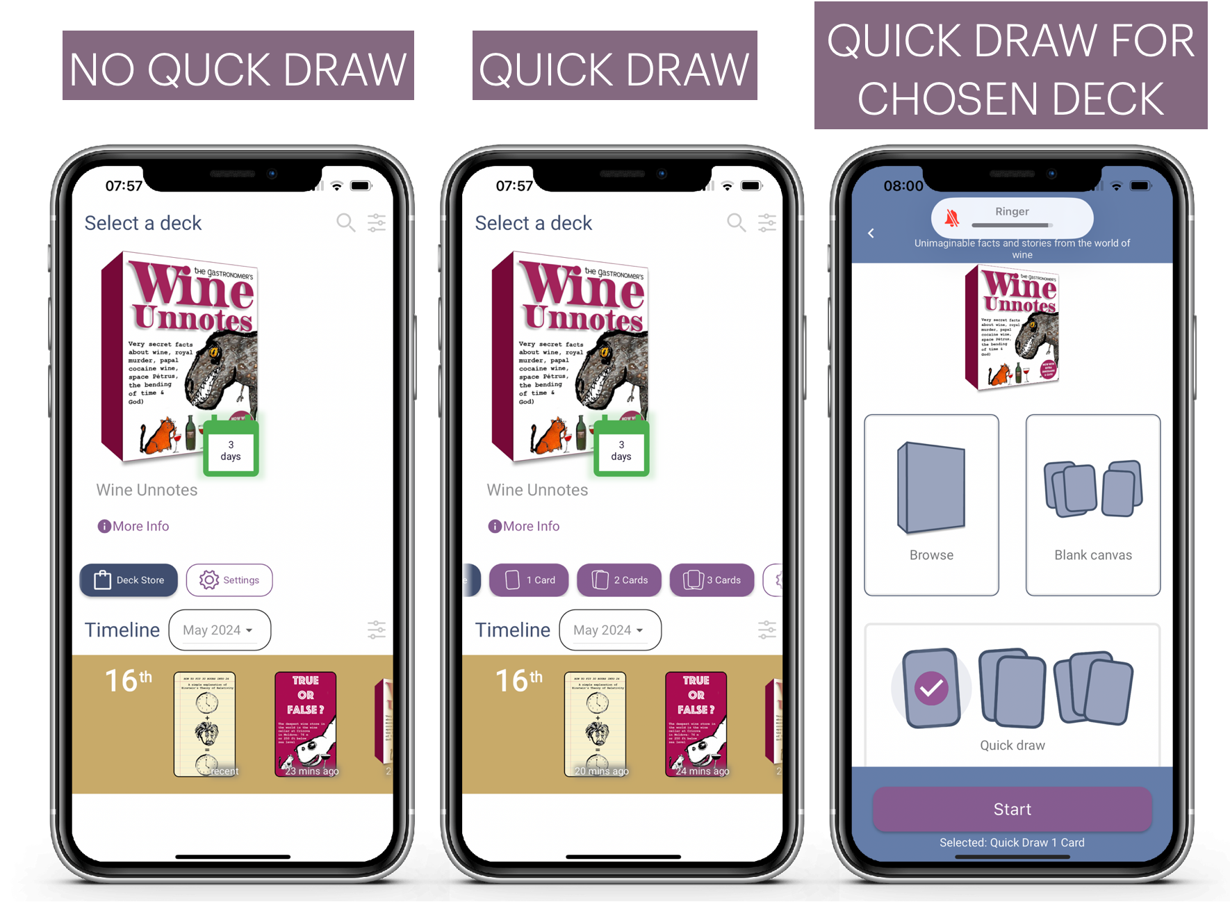
You can also choose quick draw once you have selected a deck.
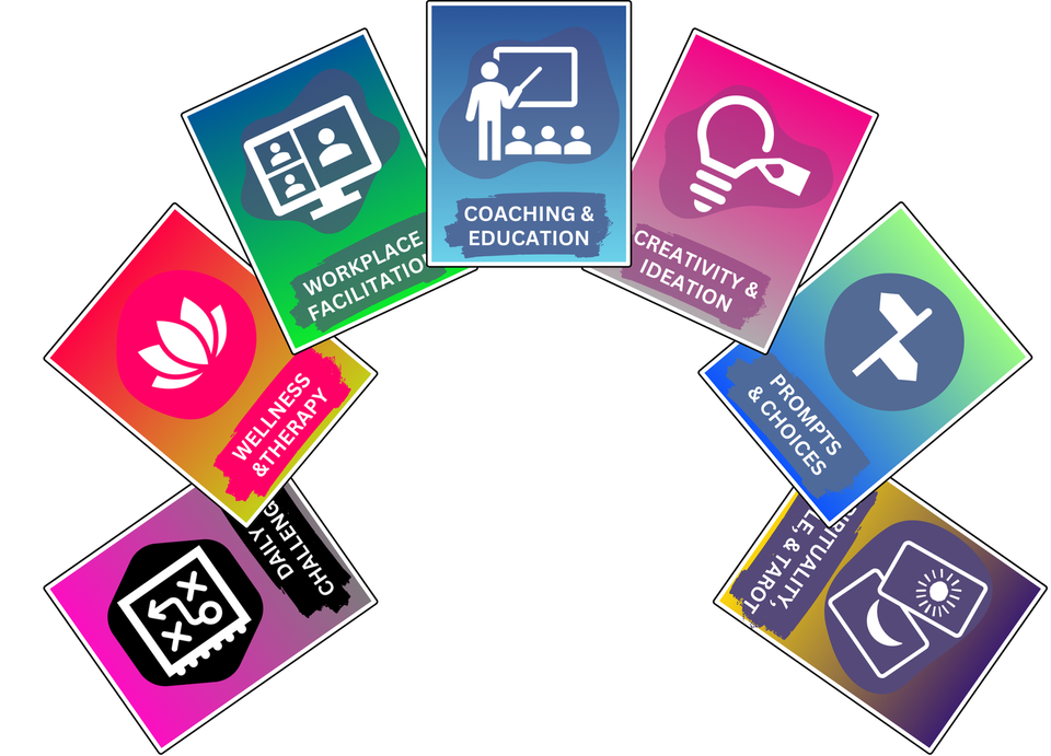
9. Seven Media Segments: There's a Deck for That
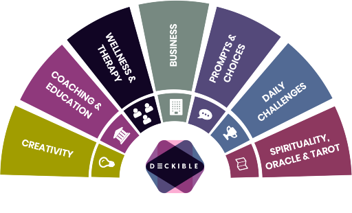
We've done a lot of thinking about the different types of Decks that exist and how to organize them. We have chosen to focus on seven segments.
- Creativity Card Decks
- Coaching & Education Decks
- Wellness & Therapy Decks
- Business Decks
- Prompts & Choices Decks
- Daily Challenges Decks
- Spirituality, Oracle & Tarot Decks
Seven segments is shorter and simpler than the original 18. We actually have many more segments below these 7. We create genres in response to needs and available decks.
You will see these in an upcoming release in the app as they take center stage and we rework the app experience in the app and on Deckible.com
The seven is a simple way to communicate the value a complete range of decks. It's also communicate the diversity of decks and many ways people use decks.
For some reasons people accept/expect that there to be books on every topic. We all use books in the same way. From front to back. We read.
Decks are different. Yes, they are non-linear, but there so much more involvement in a deck. It's all active participation.
People have not fully embraced the notion that there is a deck for everything, just like books. This will change.
Just like Steve Jobs talked about "There's an app for that"
They spent many millions repeating that simple message.
10. Other Recent Additions or Features to Showcase
- Audio/Video changes to offer seamless integration and let creators build fun courses using landscape or portrait form videos (a la youtube shorts, tiktok and reels.) - Explore the following for good examples of this
- Lou Bortone's Short Shorts Deck
- Elena Brower's Daily Ceremony Deck
- New journal / meditation interface (simpler and unified)
- New Card Mode / Canvas mode (more consistency)
- Device Synchronization (effortless synchronization between devices.)
- Working offline (Deckible decks are available to you when you have no wifi).
- Layout on the Arrange Screen is now super powerful (Explore a long press on Layout to change your current layout).
11. 50,000 Cards on Deckible
There's now more than 50,000 unique cards loaded across draft & published decks on Deckible. One of the ways we helps creators manage these cards is with the Collage Creator Tools.
12. For Deck Creators: Collage Creator Update
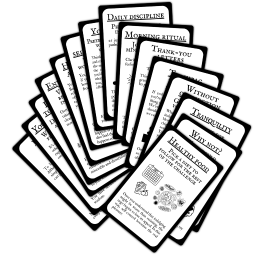
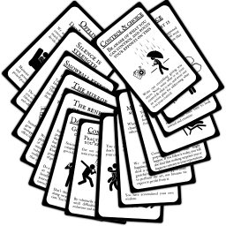
There are now two new formats for displaying hands of card - "Hand Up" and "Hand Down". These add to the many existing formats, making it a super easy way to share you deck via social and on your deck landing page.
All these are randomized and generated in one click. You can also move the cards to arrange them as you wish.

Customising Your Collages
Now you can click on any element in the collages to rotate, move and resize it.
Simply click and adjust the handlebars to suit. Also just click on white space to remove the handlebars. If you save to collages the handlebars are automatically removed.
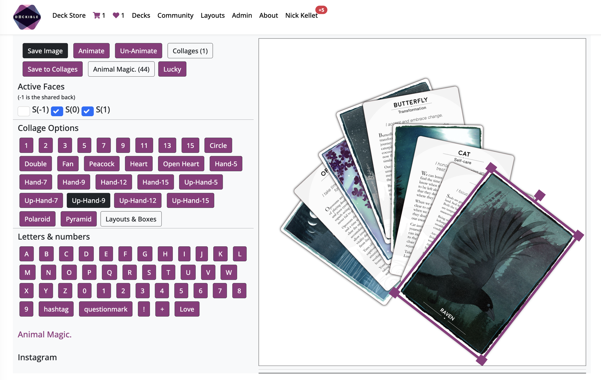
Here I just expanded one of the cards in the heart. Fun, simple and the good kind of addictive.
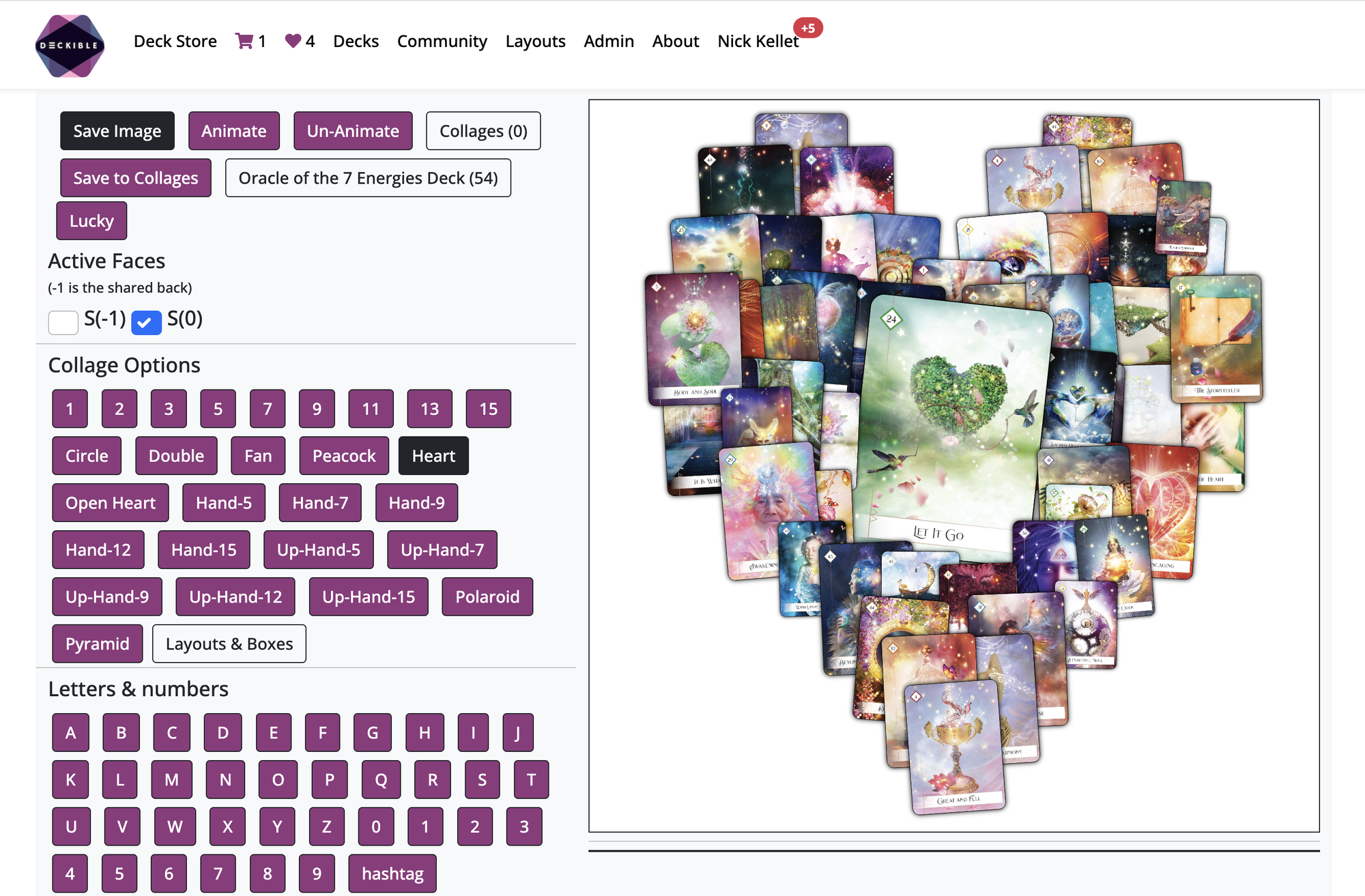
This is such a huge time save for creatives.
13. Behind the Scenes
We have made many hidden changes to ensure our infrastructure is well positioned and future proofed for all the things we plan to add to the product. This has been a big release on this front. All stuff you can't see, one example is the infrastructure to send emails and or in app alerts.
Well share more on this in forthcoming releases.
14. Trials & The Tech Adoption Curve.
We have added deck trials for users. Every user has 3 trial credits. Each credit gives them 3 days of use of any deck. When tey buy a deck they receive a new trial credit.
Trials exists because not everyone will buy new products on new platforms from day one. Adoption of any product takes time.
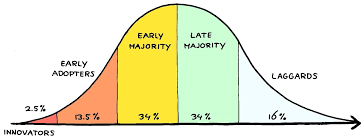
This "curve is normal. It was experienced by Kickstarter, Etsy, eBay, AirBnb, Uber, Amazon, Apple and more.
Trials are all about removing barriers for people. Remove friction. Remove excuses.
So far we have proven people use Deckible regularly and they come back and buy many decks. With trials we are letting more people try decks without the risk.
You can try any deck for 3 days. You begin with 3 credits. We need to limit people because with 700+ decks you could keep trying decks and never buy anything. And that would be fun, but would not create a thriving business.
Buying are deck get you a new credit. We will be adding other incentives to get more credits.
Credits give you full access to the deck, so it's not like the preview available on Audible. You can preview every deck from the landing page.
We know this is exciting and a game changer.